[ An annual celebration of the eclectic and experimental use of typography and language in creative practices in the Visual Communication programmeat the Royal College of Art]]]]]]]]]]]]]]]]]]]]]]]]]]]]]]]]]]]]]]]]]]]]]]]]]]
[[[[[[[[[[[[[[[Open View]]]]]]]]]]]]]]]{{{Thursday, June 25}}}
]]]]]]]]]]
{
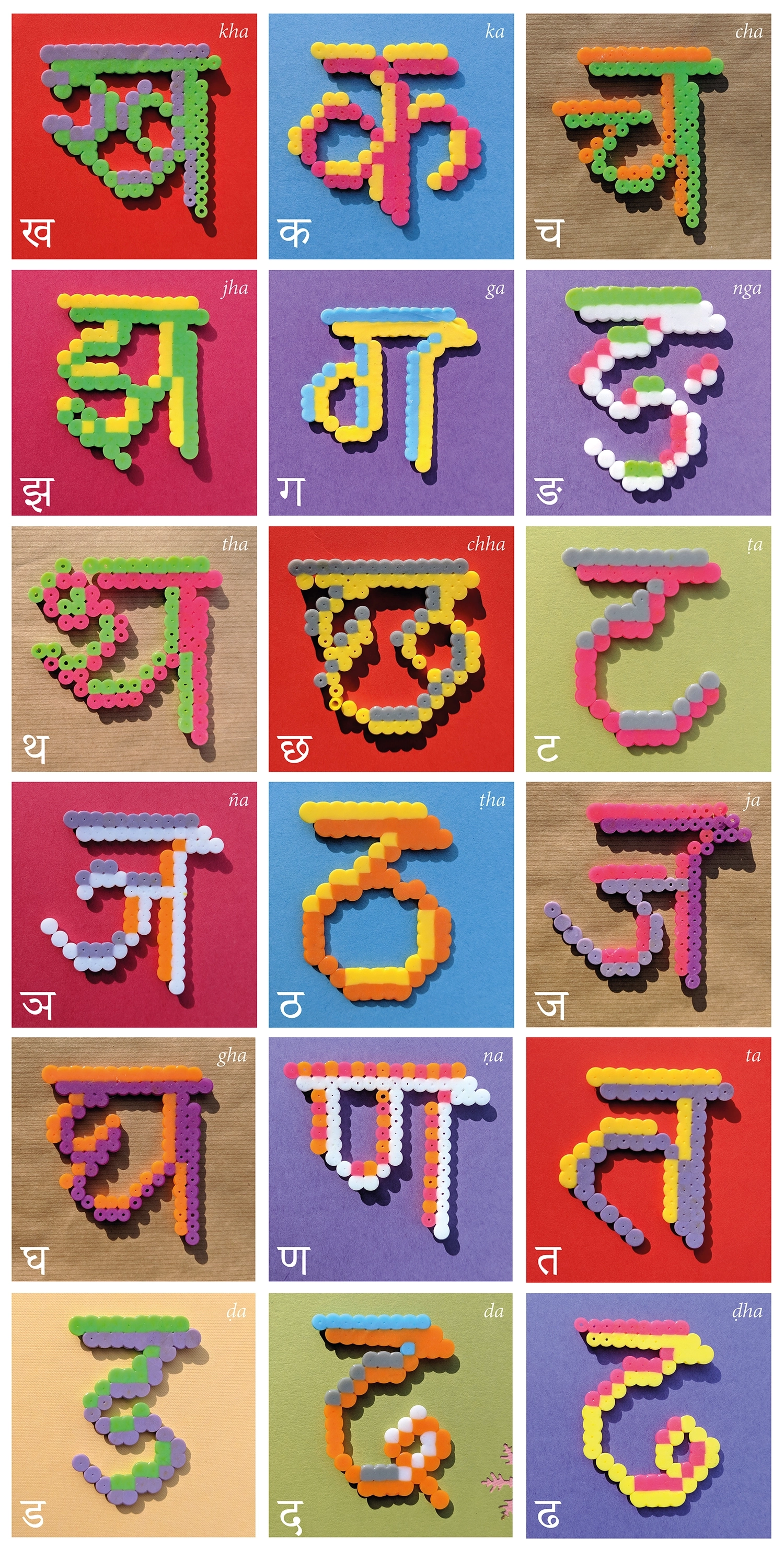
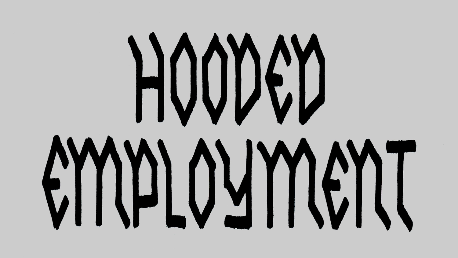
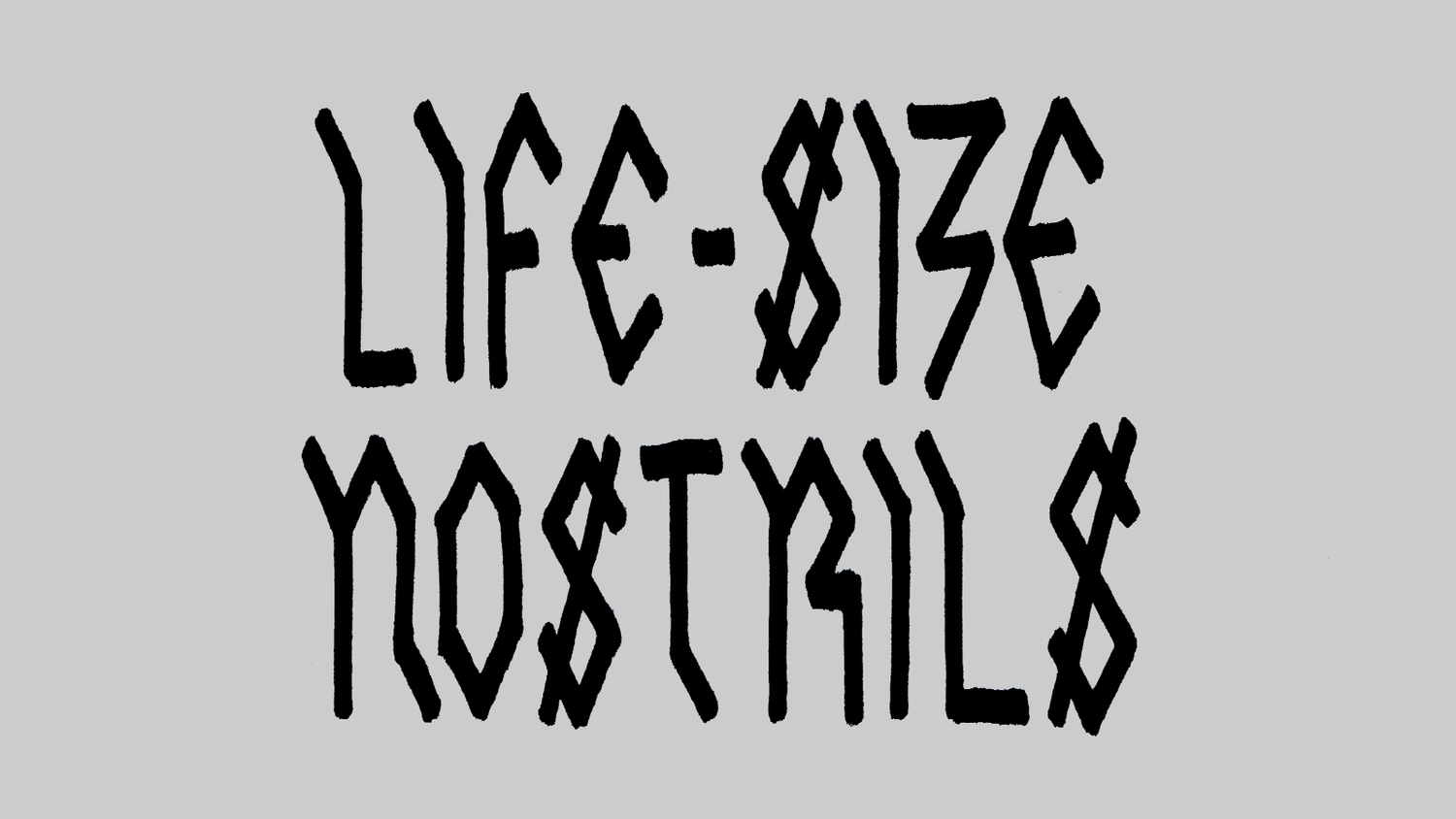
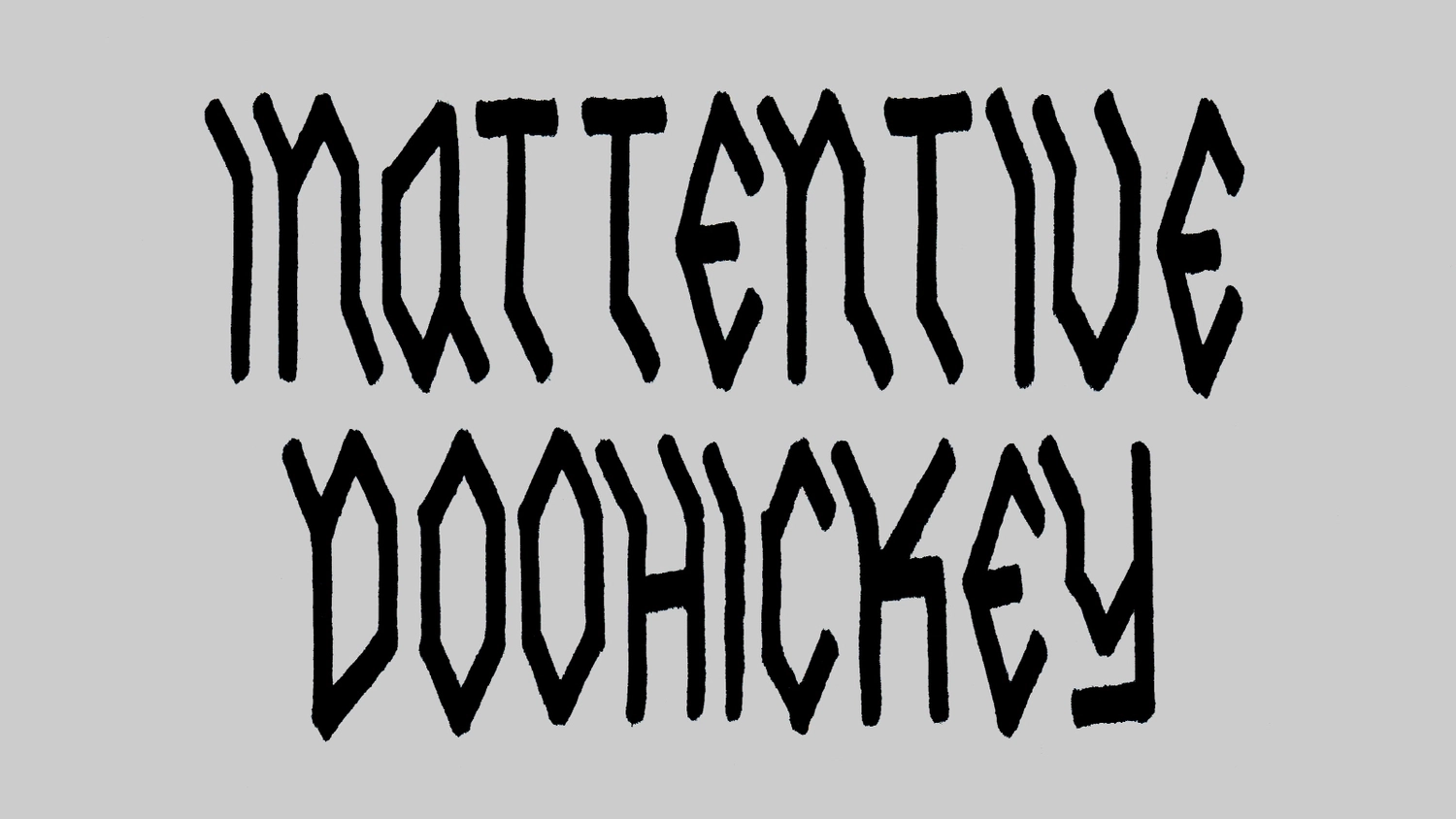
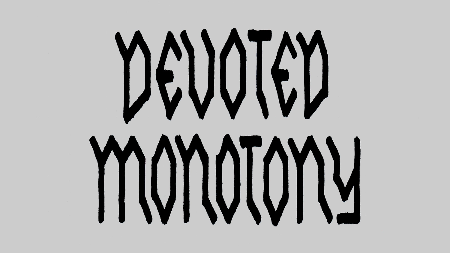
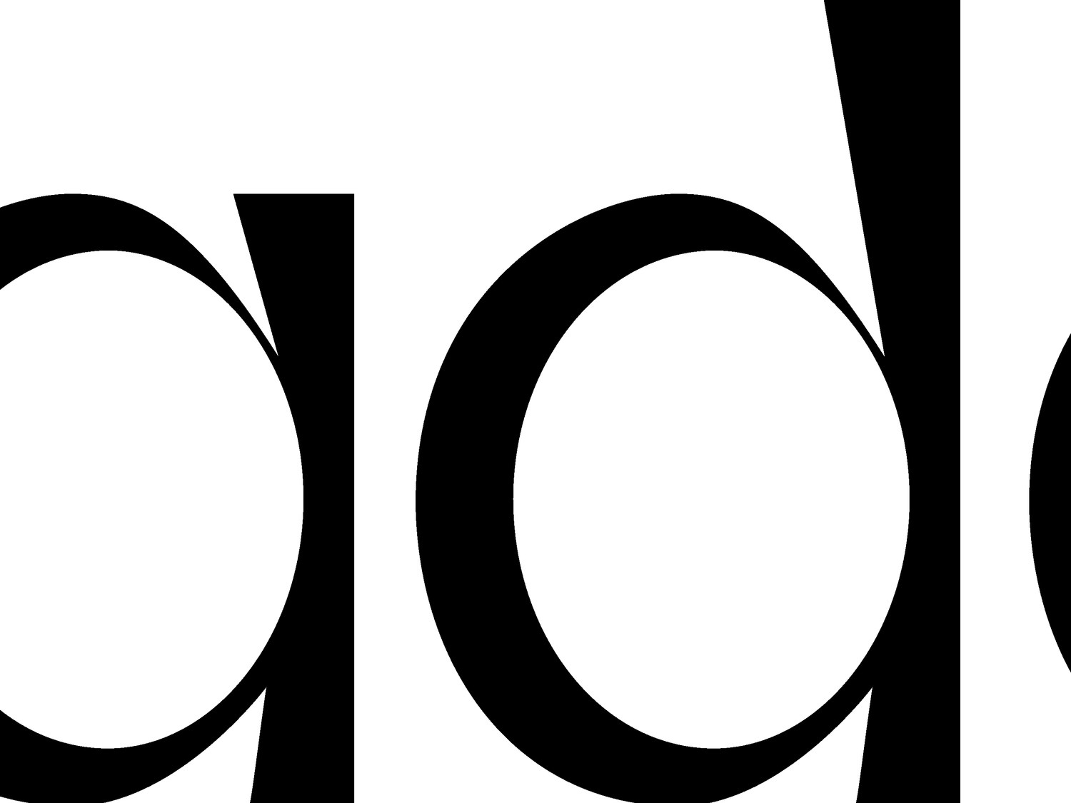
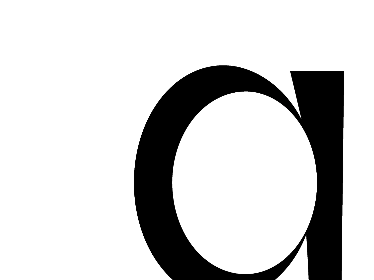
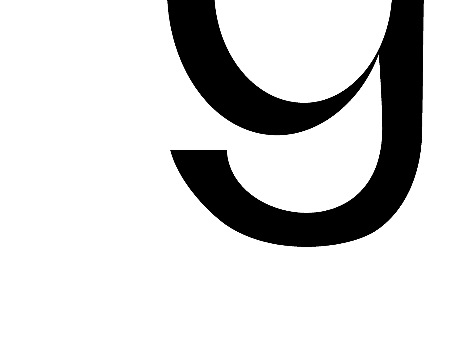
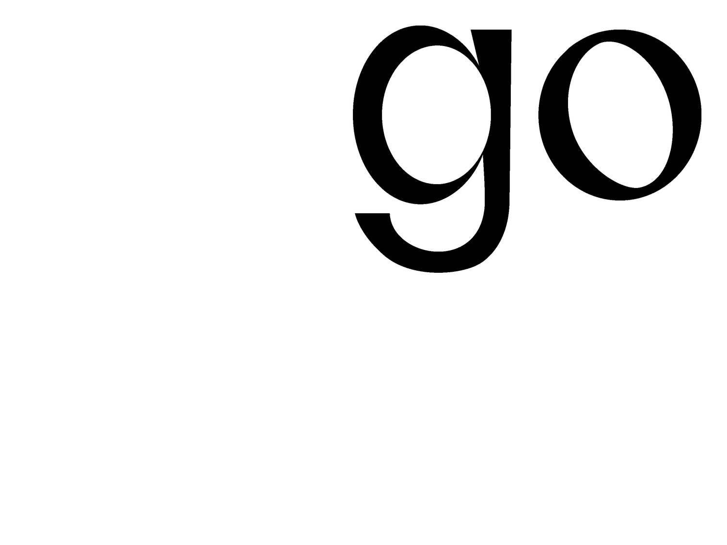
Edible Plastic
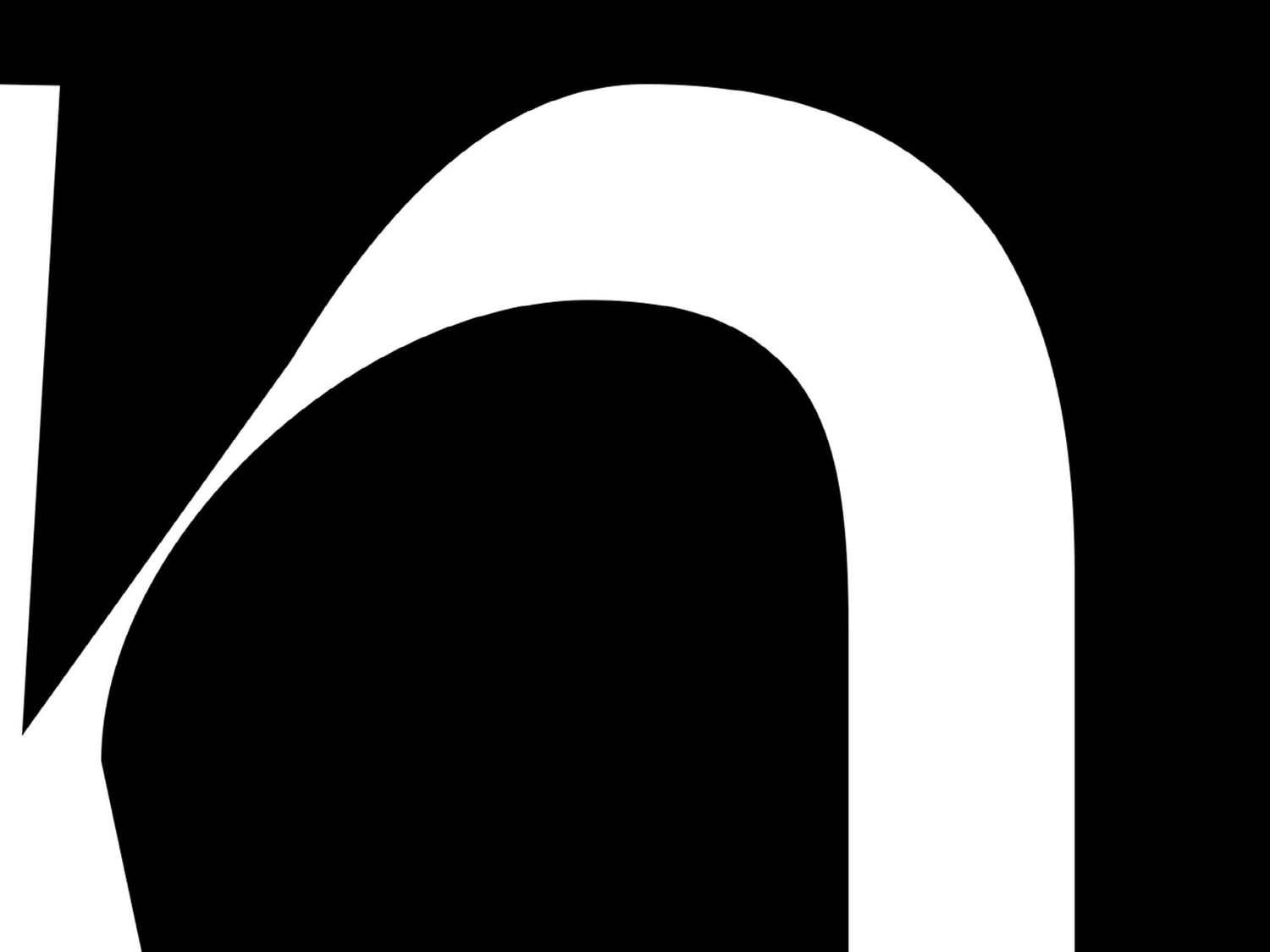
I wanted to explore the idea of setting an algorithm, and allowing automatic/logical visual results to develop; but in an analogue sense of creation. The medium would define the glyph’s structure, and so the typeface would be pixelated; the glyphs would maintain pen-nib stroke qualities; lastly I wanted to create this in the Devanagari script: which is the base script for languages like Hindi, Marathi, Kashmiri; and is mainly used in India, Nepal and Tibet.
What is the ratio of visual abstraction to legibility in this typeface? Keeping in mind that Devanagari is fairly new to pure conceptual experimentation as opposed to say Latin, given that its use is limited to more traditional print and web applications, because of a largely conventional audience, in my opinion.
Aakriti Khurana
{}
}
{
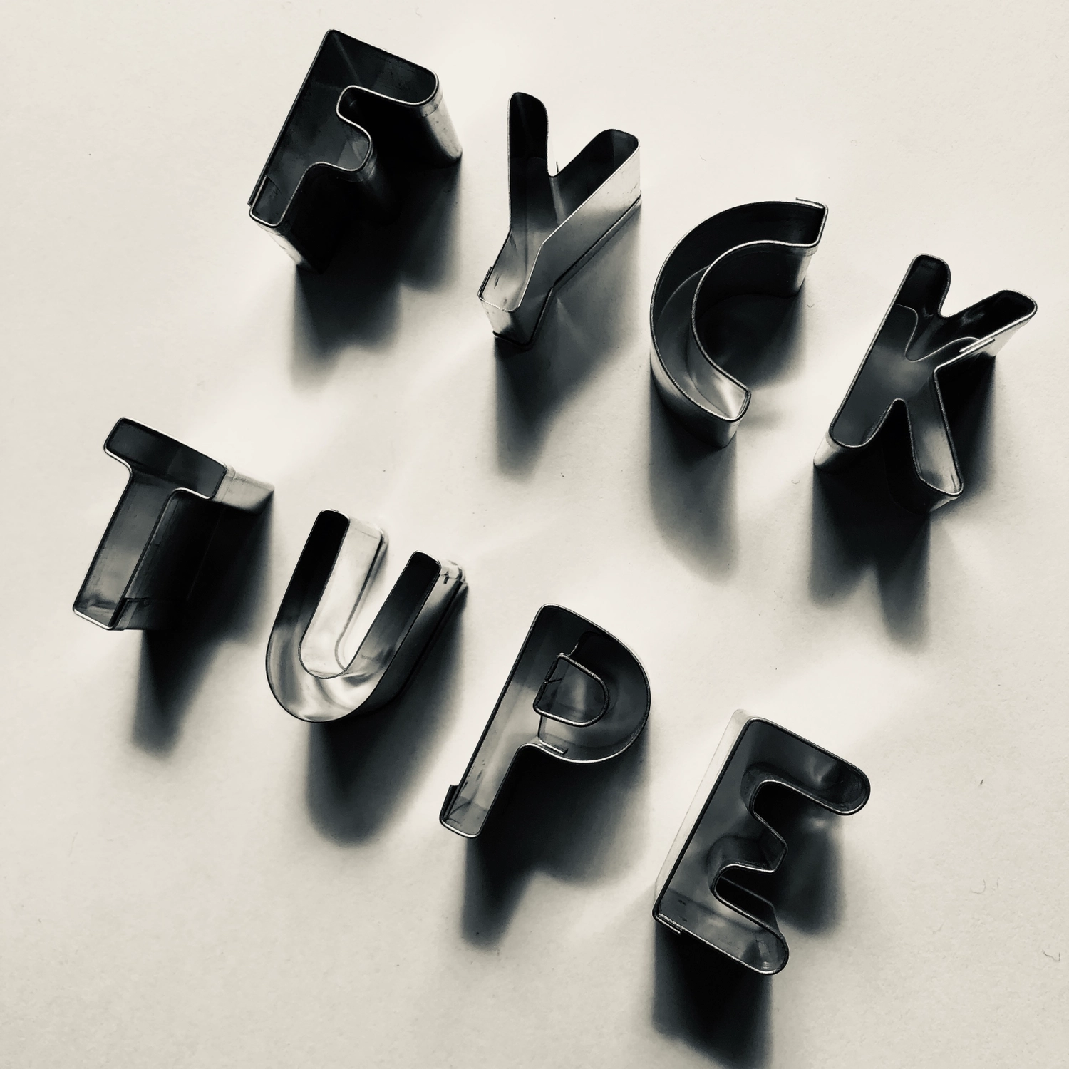
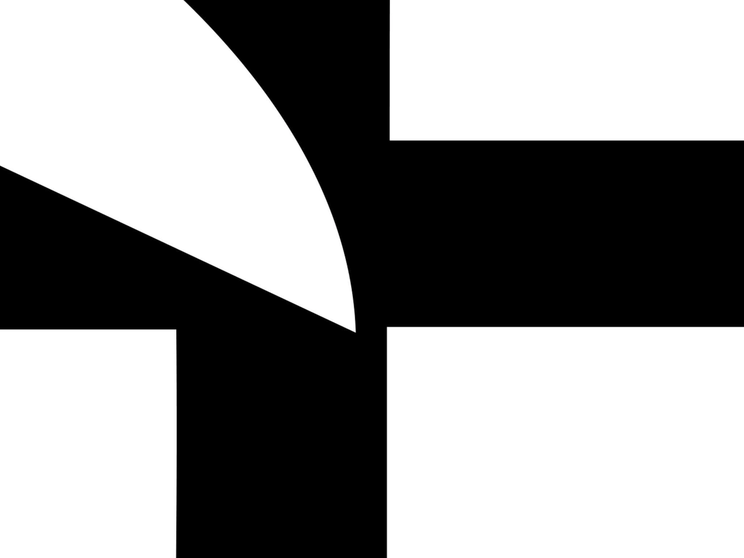
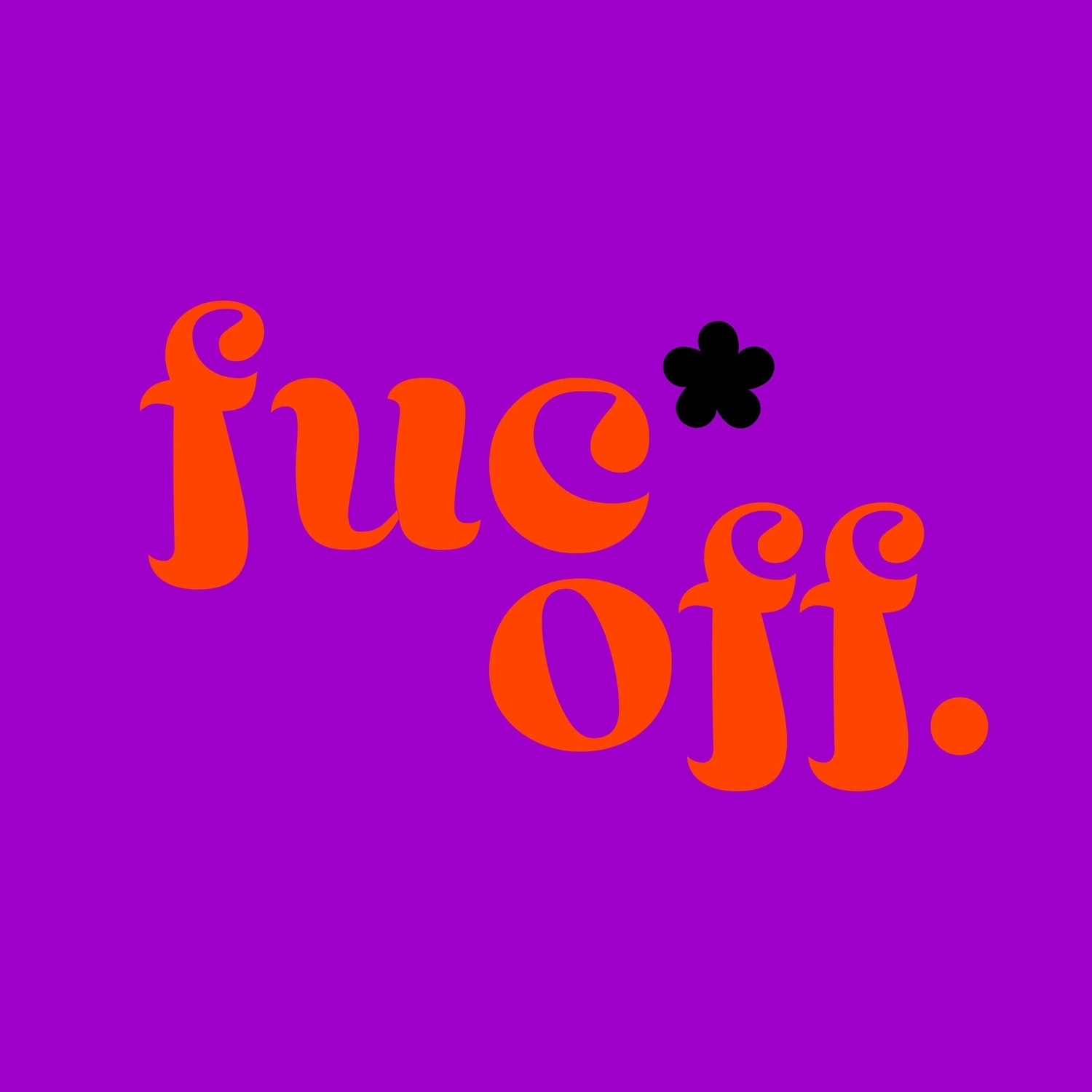
Cold Metal Typography
I recently invited the designer Rejane Dal Bello to give a talk on typography. Her opening slide read: Fuck Type. I think she was saying it’s not the type that matters, it’s the message. Of course type matters, but only when we don’t neglect the message. This piece of cookie cutter type echoes Rejane’s message and celebrates my inability to spell correctly.
Adrian Shaughnessy
{}
}
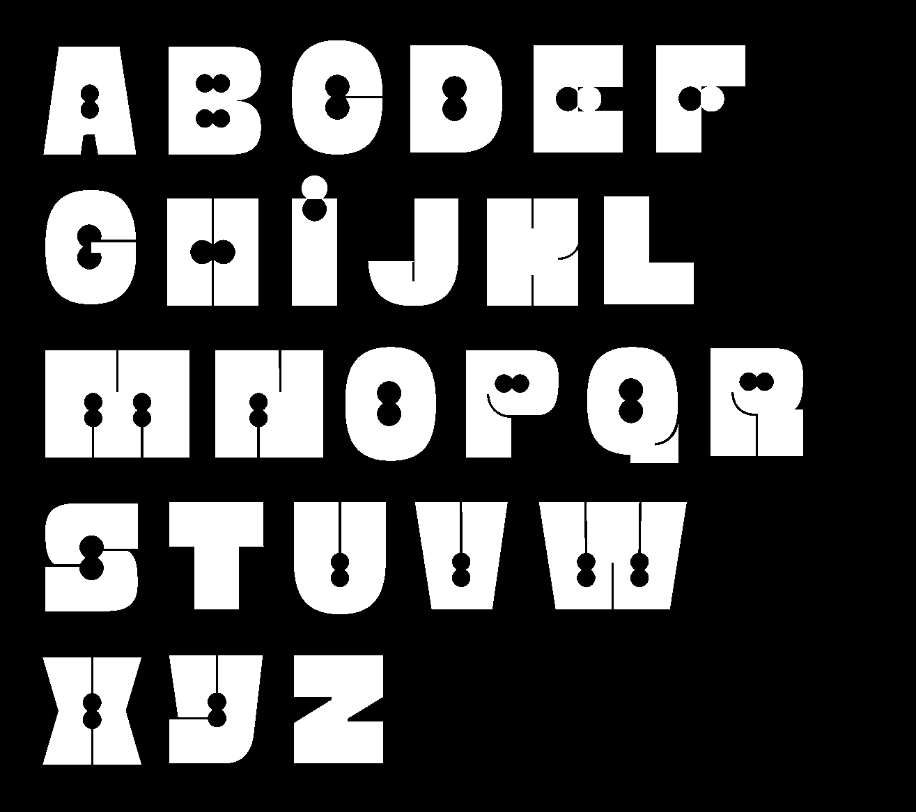
{
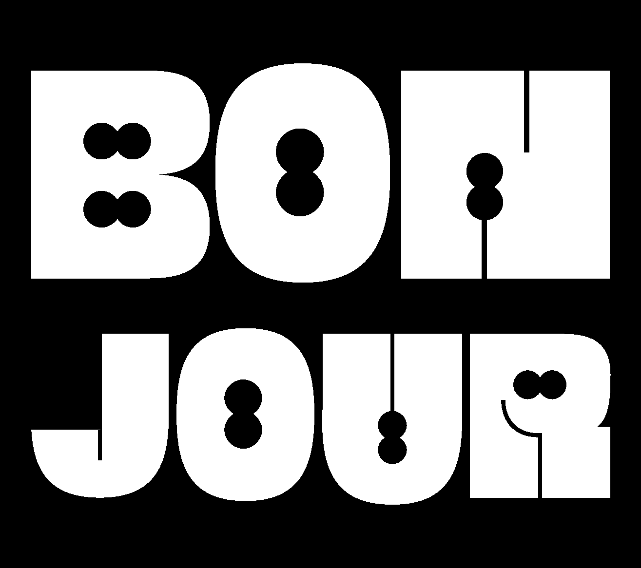
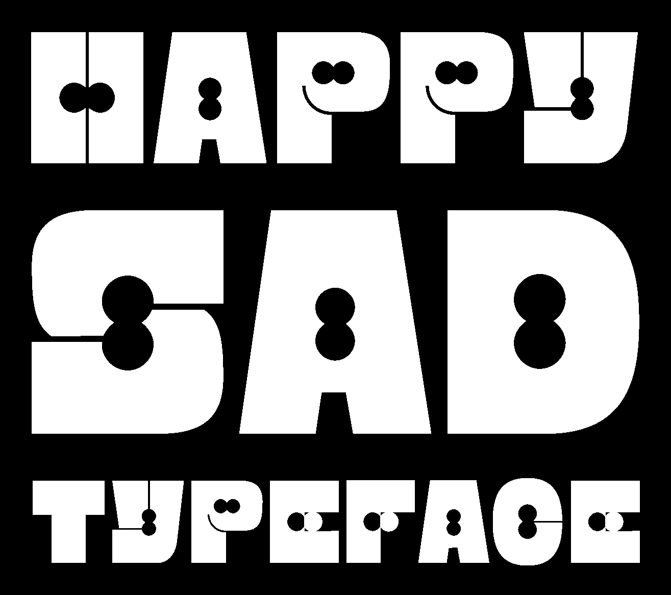
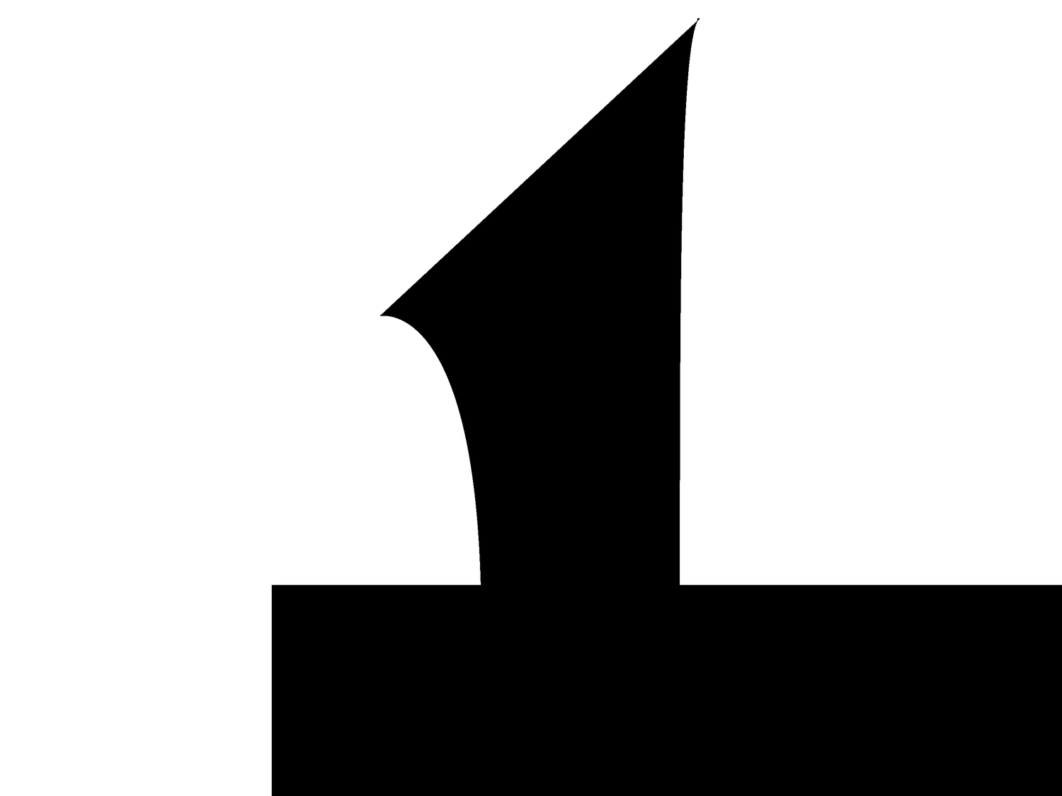
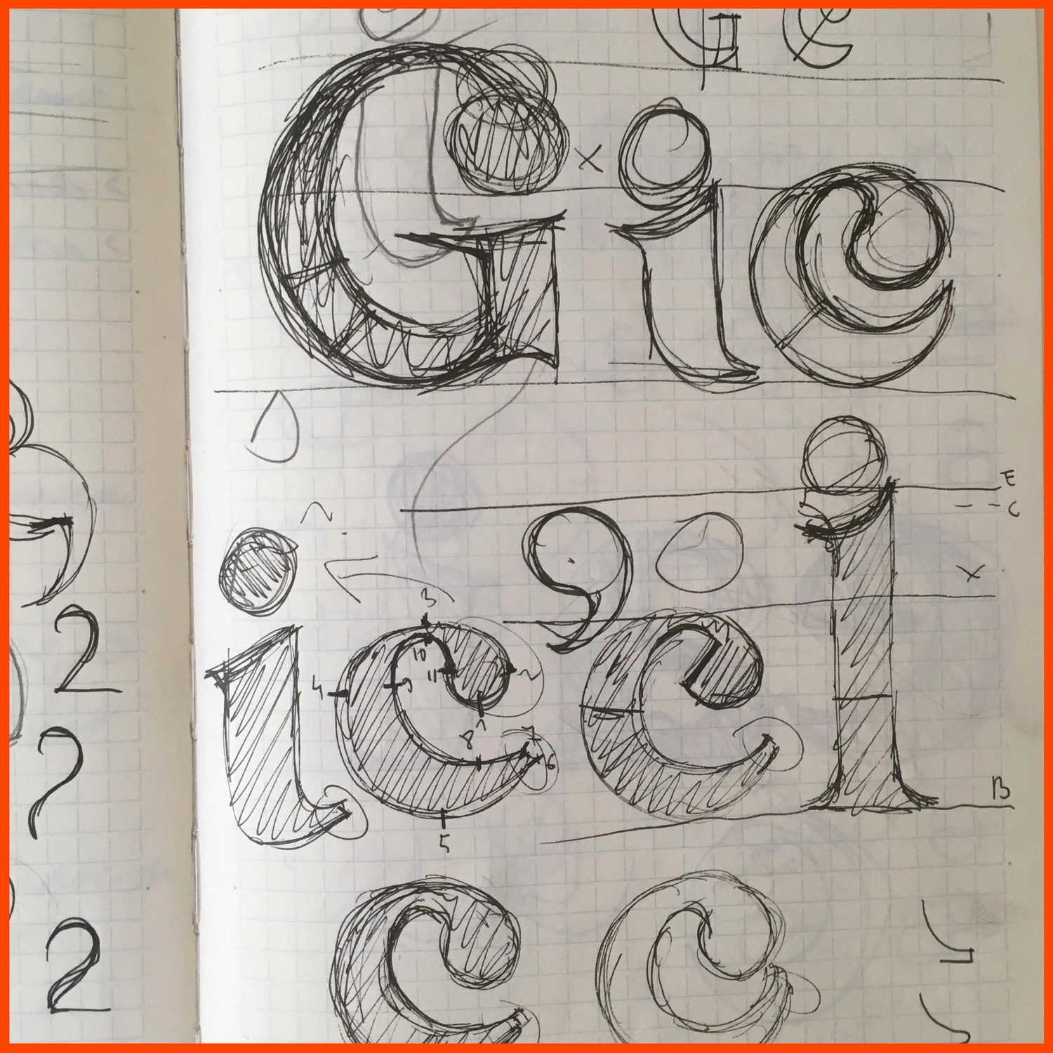
Happysad
Happysad was originally designed because I was looking for an original typeface to use on my website but none seemed appropriate to me. So I decided to design my own personal typeface by using my 'happysad' doodles to create an abstract shape which would end up in each of the letters. The idea was to create a playful typeface by using contrast between positive and negative spaces: the outside of each letter is made with very simple shapes but inside, the abstract shape is here to bring some more fun to the typeface. We can even find smilies in some letters but they are simply suggested.
Anastasia Arjalies
white
see
rtsrfse
{}
}
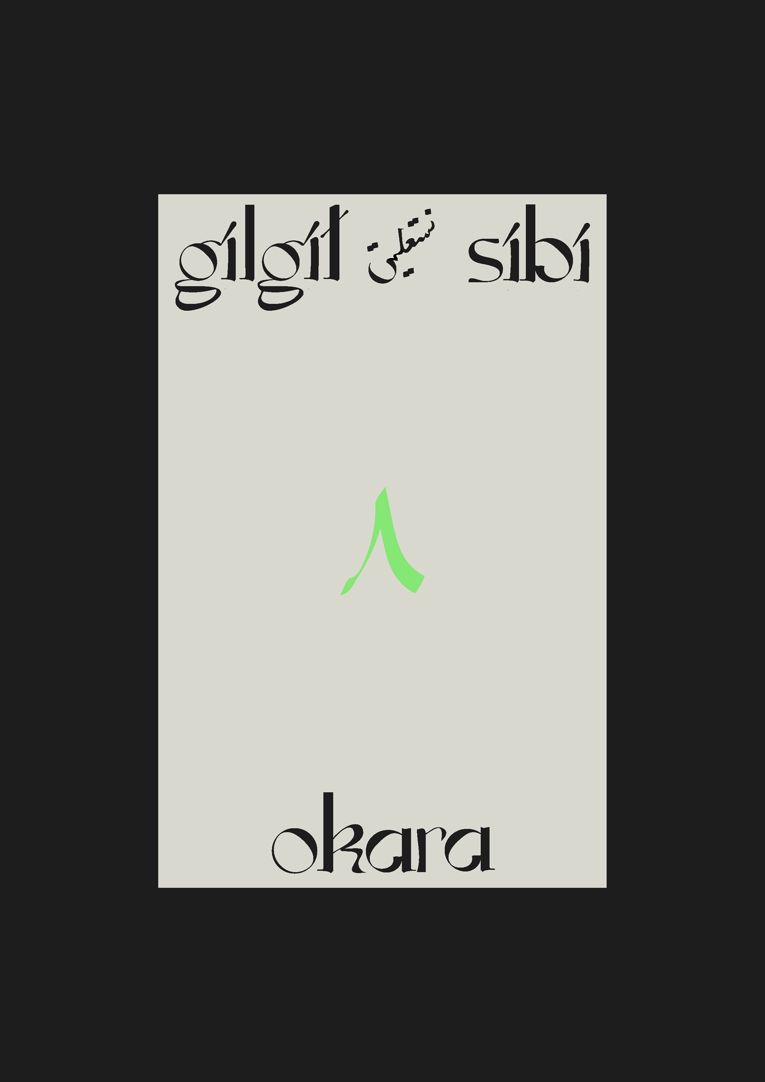
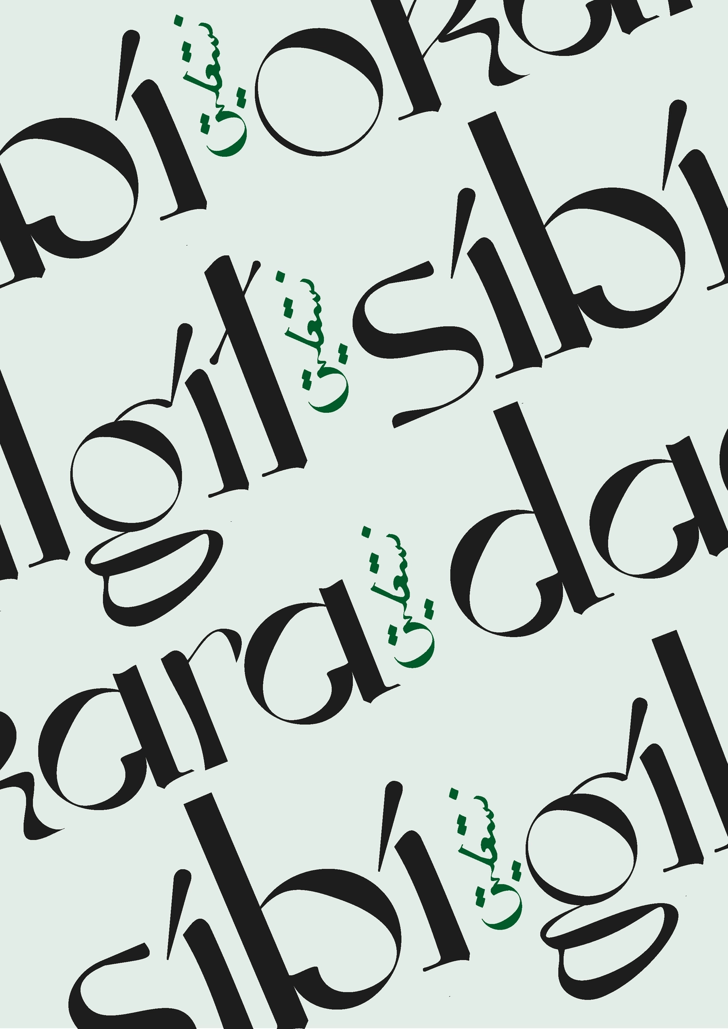
{
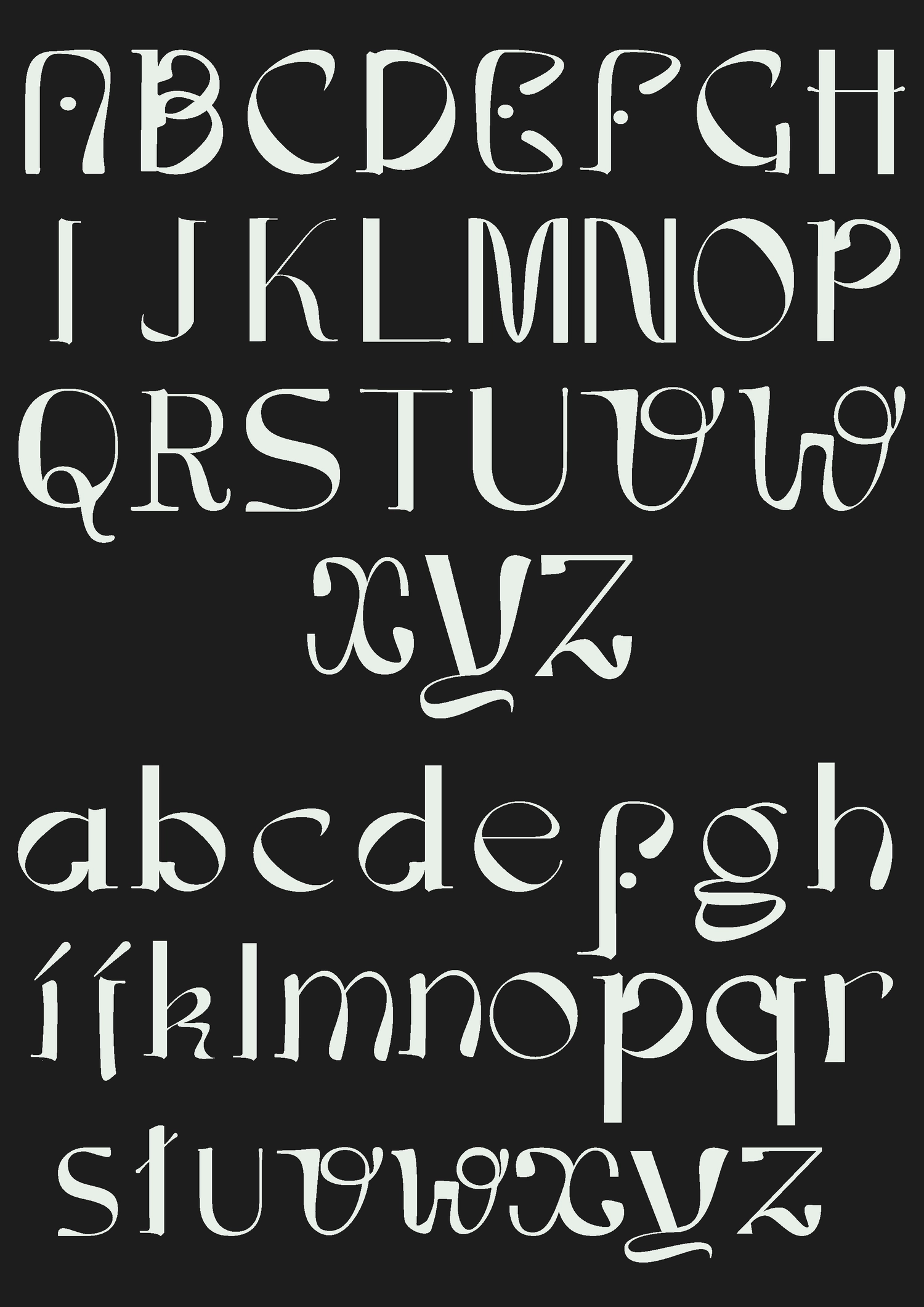
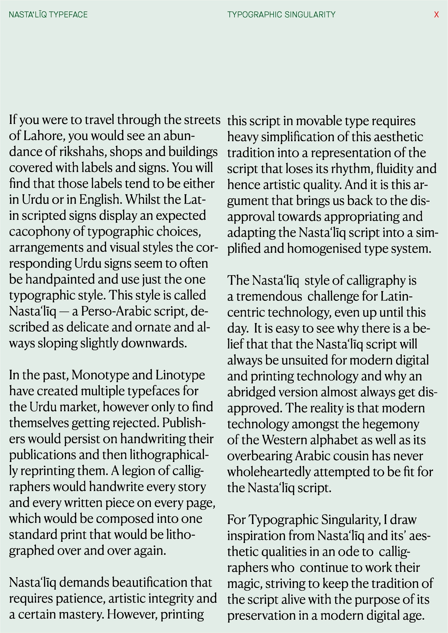
NASTA‘LĪQ
Nasta‘līq — is a Perso-Arabic script, described as delicate and ornate and always sloping slightly downwards. Nasta‘līq demands beautification that requires patience and calligraphic integrity. However, printing this script in movable type requires heavy simplification of this aesthetic tradition.
It tends to lose its rhythm, fluidity and hence artistic quality within a homogenised type system. For Typographic Singularity, I draw inspiration from Nasta‘līq and its ’aesthetic qualities in an ode to calligraphers who continue to work their magic, striving to keep the tradition of the script alive with the purpose of its preservation in a modern digital age.
Bakhtawer Haider
{}
}
{
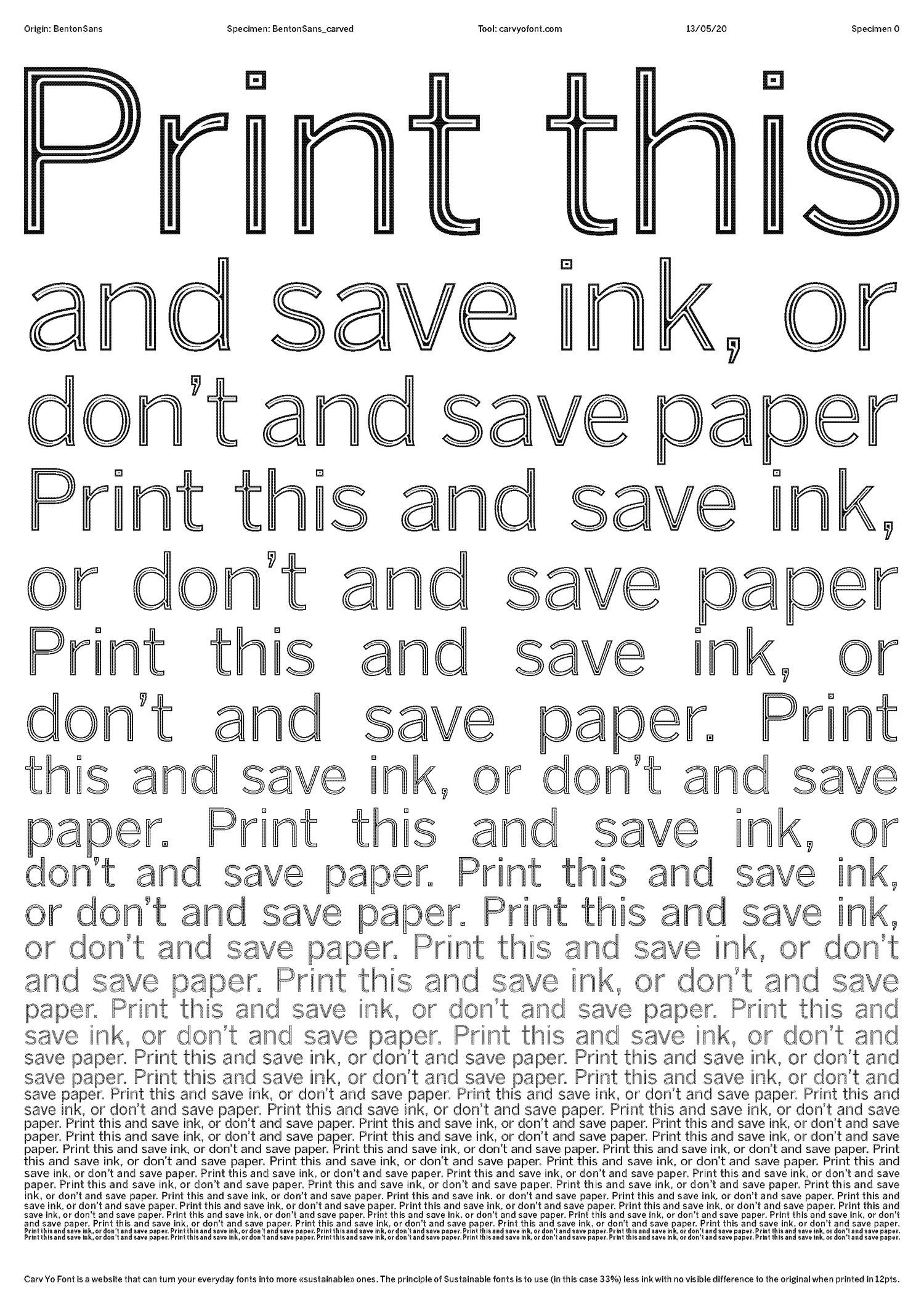
Carv Yo Font
Carv Yo Font is a speculative program/website that can turn your everyday fonts into more «sustainable» ones. The principle of "Sustainable fonts" is to use (in this case 33%) less ink with no visible difference to the original when printed in 12pts. The first font I experimented with is BentonSans Regular the RCA body text font. Through this subversion, I wanted to make a comment on the institution current lack of actions regarding sustainability. This method was inspired by Ryman Eco and the Ecofon and remains a theoretical project for now but will hopefully exist soon.
Betty Brunfaut
WHO AM I SENDING THIS TO?
{}
}
{
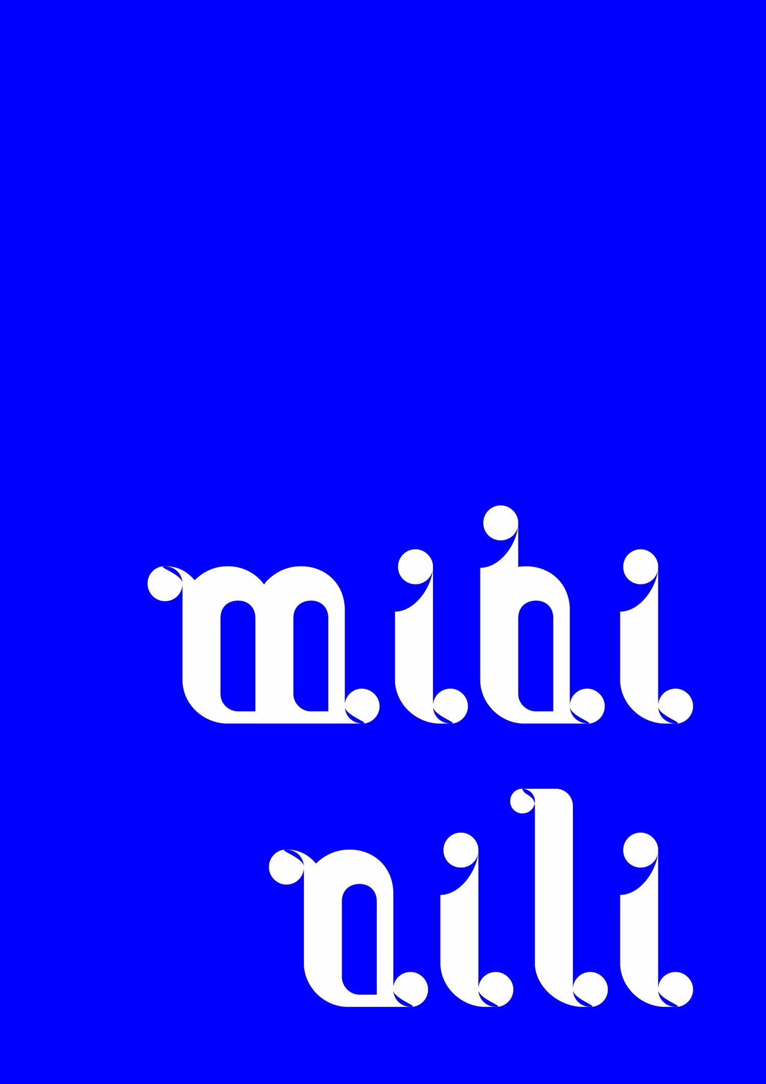
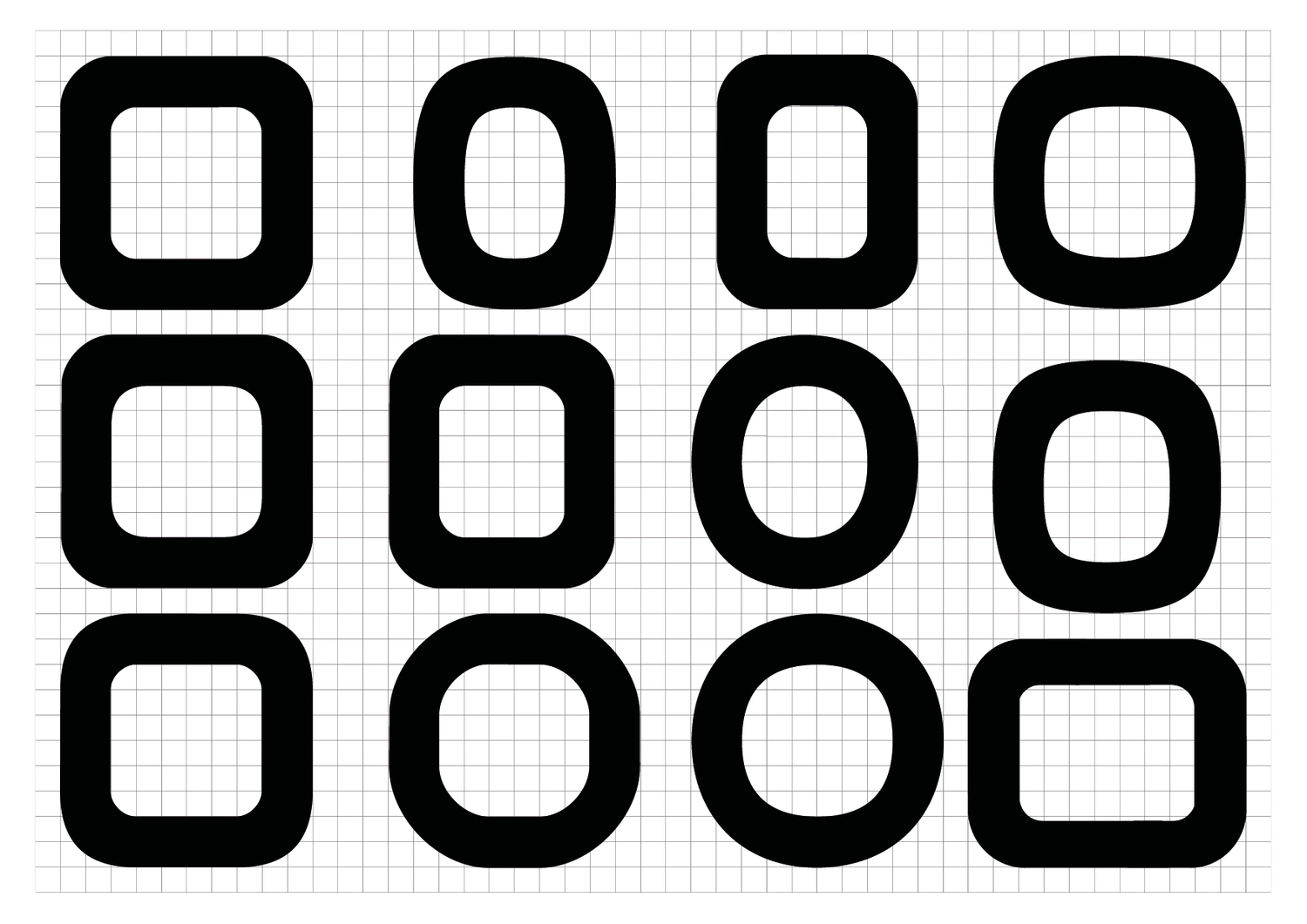
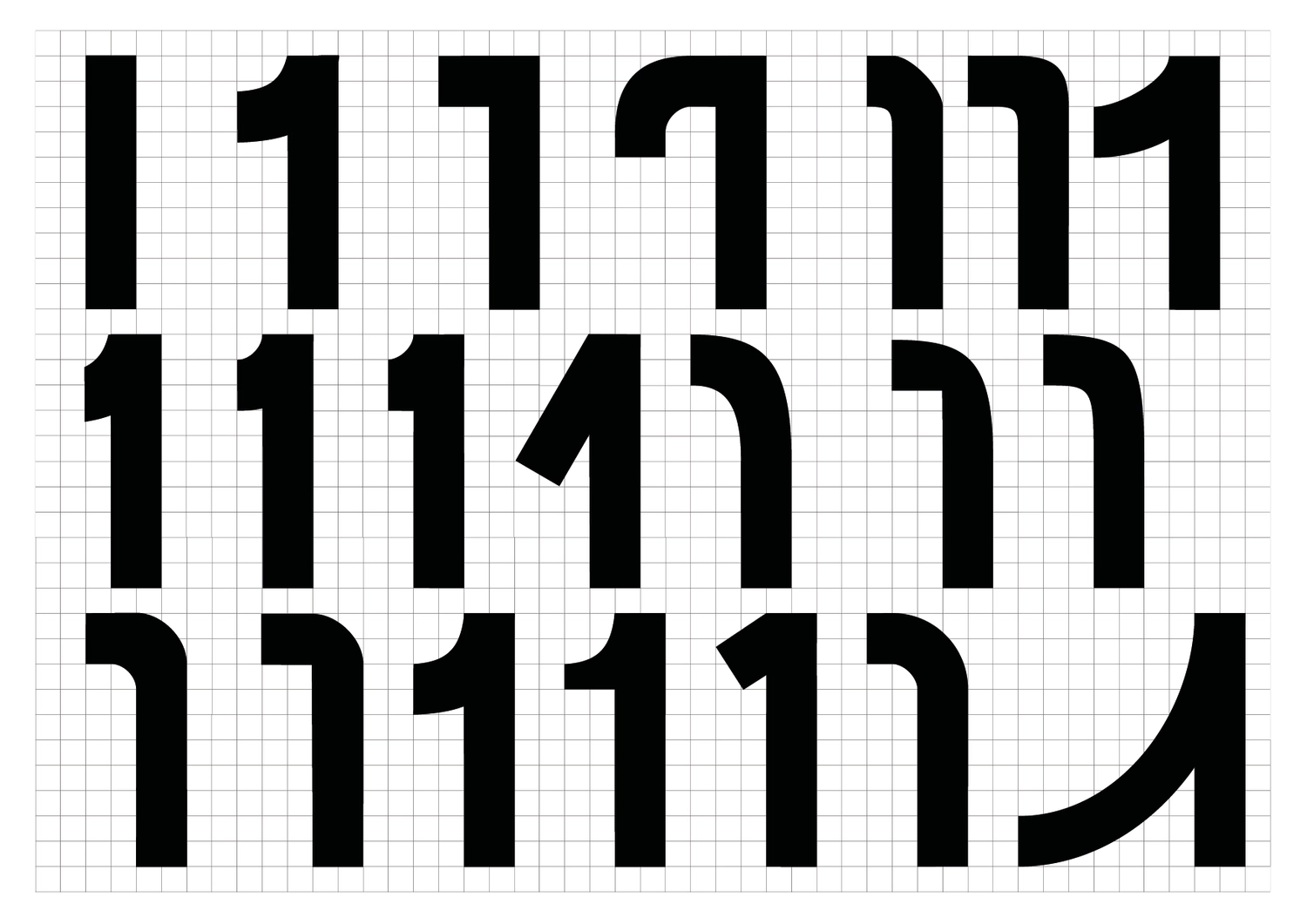
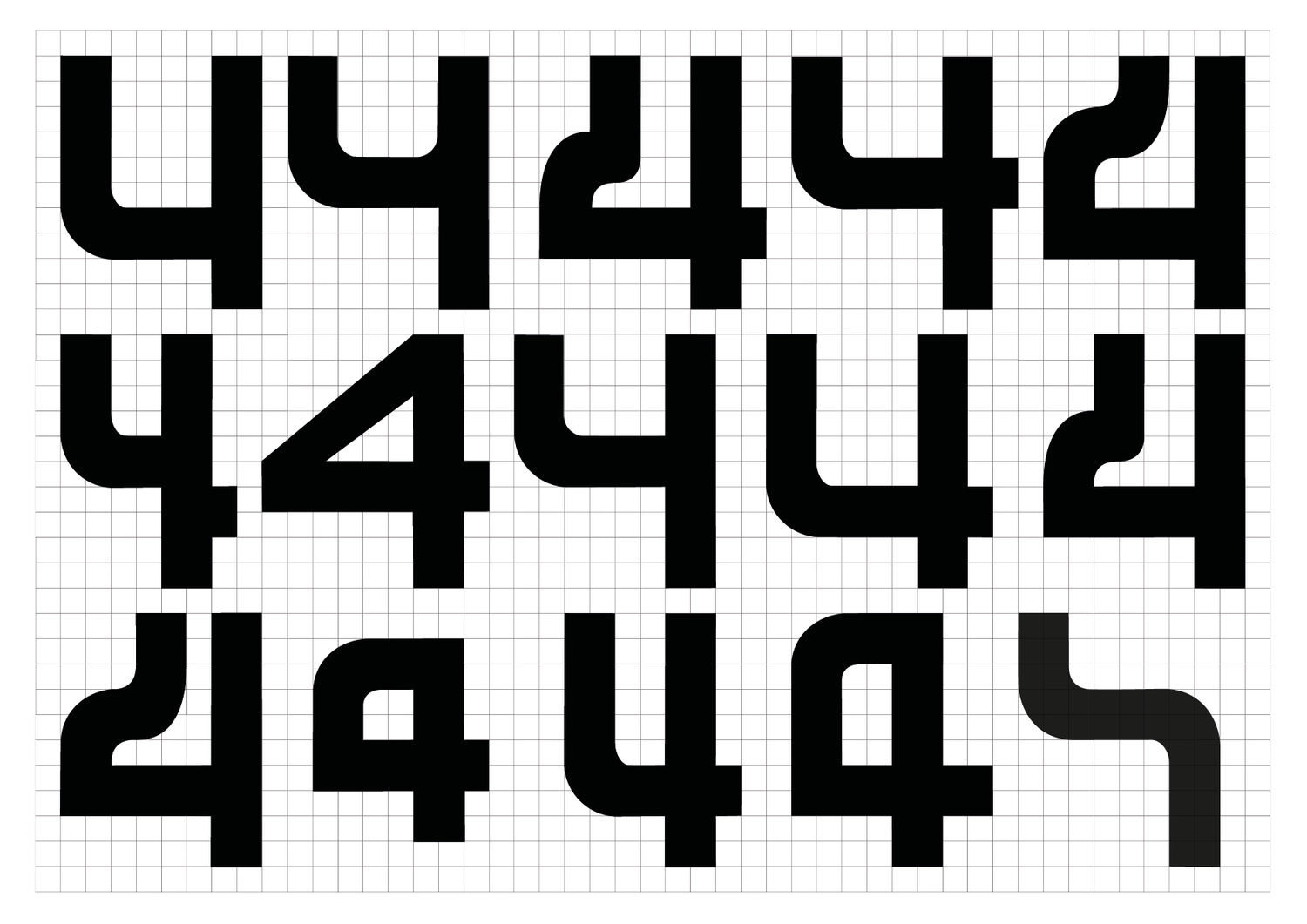
Mihi Nili
Mihi Nili is a display typeface designed during Radim Peško's workshop Type Family at the RCA.
The idea behind those quirky letters comes from the way I was feeling in an airplane this February: I was warm, sweaty, like melting. So I decided to 'glue' the bottom of the letters, and to fill spaces that are usually empty. I played with round shapes appearing in each letter, like drops on the characters.
Mihi Nili is an attempt to translate a sensation I've experienced through a system of letters.
Camille Le Flem
{}
}
{
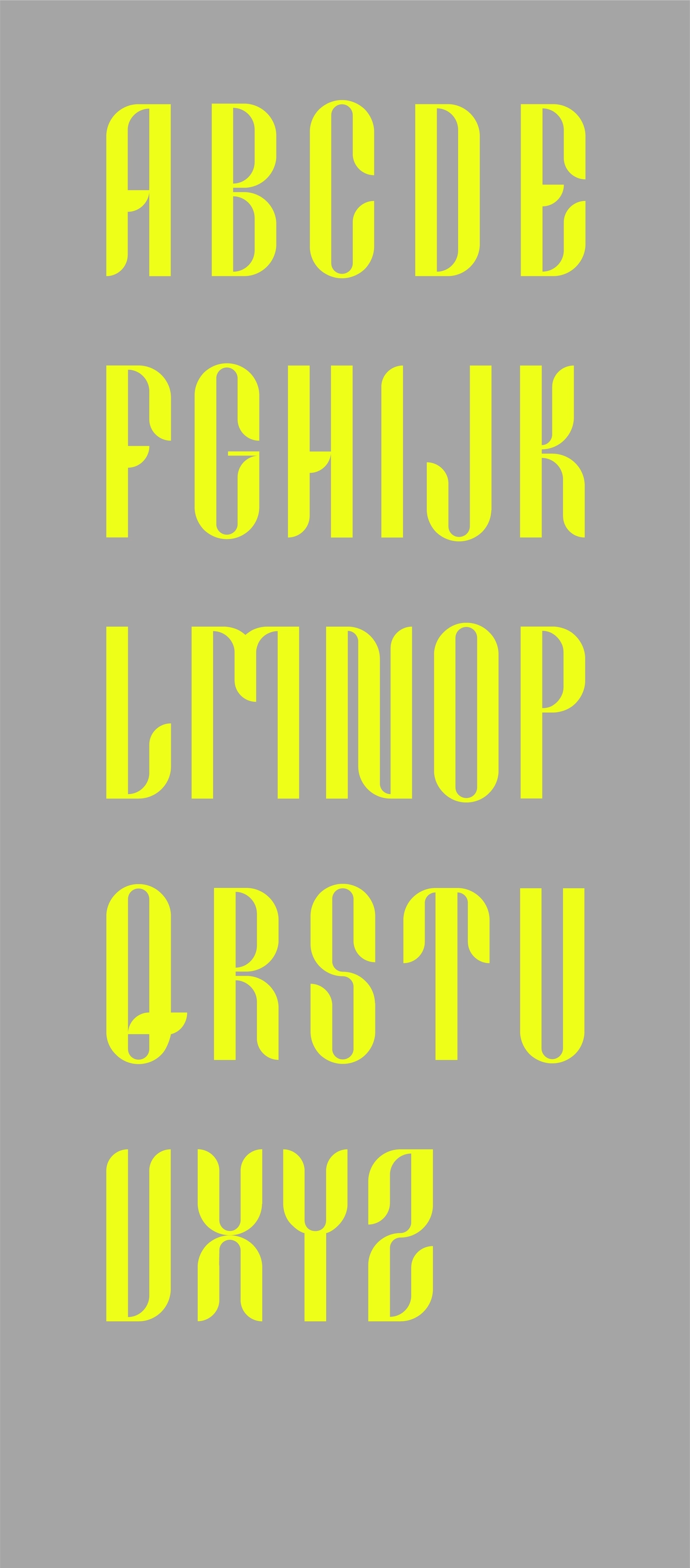
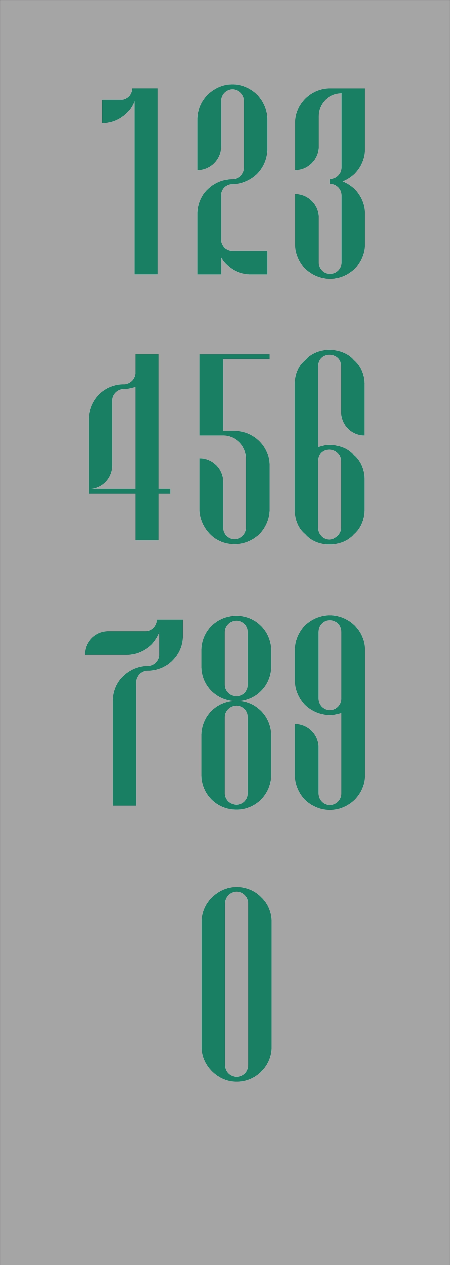
Quintain
Quintain is a high-contrast serif typeface, mostly inspired from the work of Aldo Novarese and Jean Jannon. It’s initial intention was to be displayed in larger point sizes but in the process the lowercase was adapted for legibility on smaller body copy. It’s features lend themselves to a classical tone, but the interplay in contrasts and sharpness places it in multiple contexts.
Costas Kalogeropoulos
{}
}
{
Will Font
My first font was created by adapting the natural curves and weights of calligraphy to a more systematic, modulable system of simple shapes.
Inès Iragui
{}
}
{
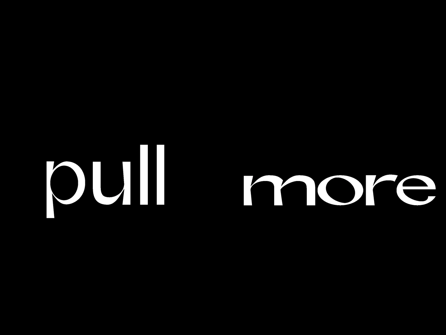
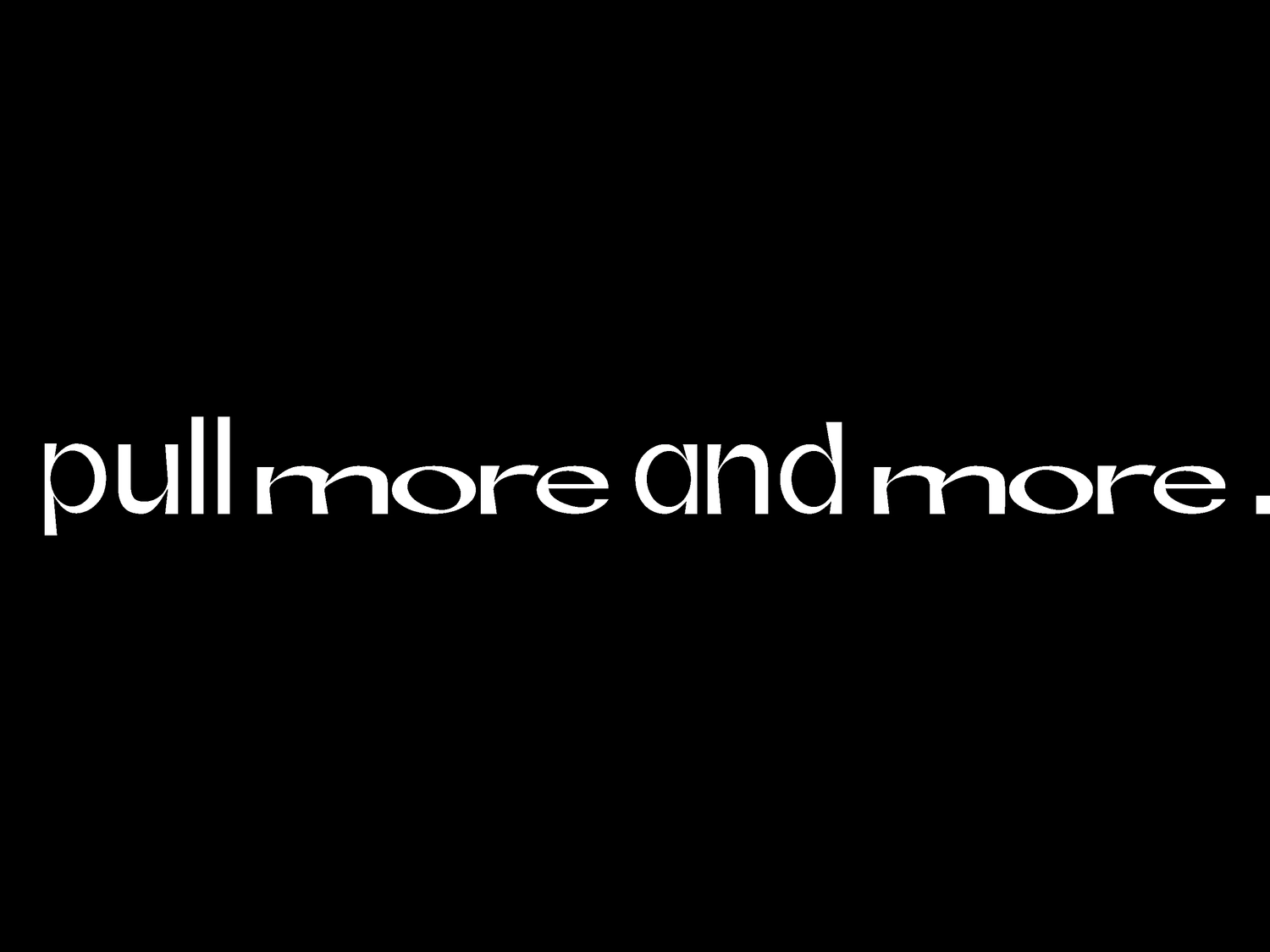
Just In Case (JIC)
Type shaped by one of the world's most underestimated of cultural assets: toilet rolls. The way this 'symbol' is displayed activates a narrative – from an abstract construction to a legible form of communication, through the use of type.
Toilet paper has taught us an unexpected lesson about the human psyche in a situation of both fear and anxiety.
This context reveals forms of behaviours that look upon only and uniquely oneself. Hoarding/stockpiling is a transparent reaction that portrays the lack of community-mindedness on both personal and national scale.
José García Oliva
{}
}
{
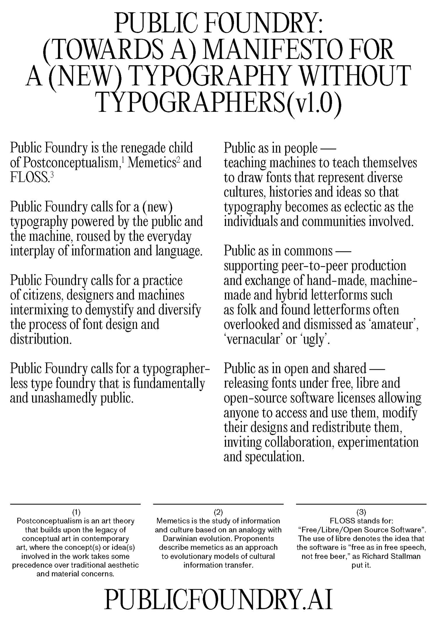
Public Foundry: (Towards a) manifesto for a (new) typography without typographers (v1.0)
Public Foundry asks humans and machines to collaboratively cultivate a new typography that values reinterpretation (read: remixing) over replication (read: copying), initiating and facilitating ways forward, both artistically and scientifically, calling for a statement of priorities, values and incentives for action. To this end, we wrote a manifesto (of sorts).
Joshua Trees, Yvan Martinez, Krister Olsson
{}
}
{
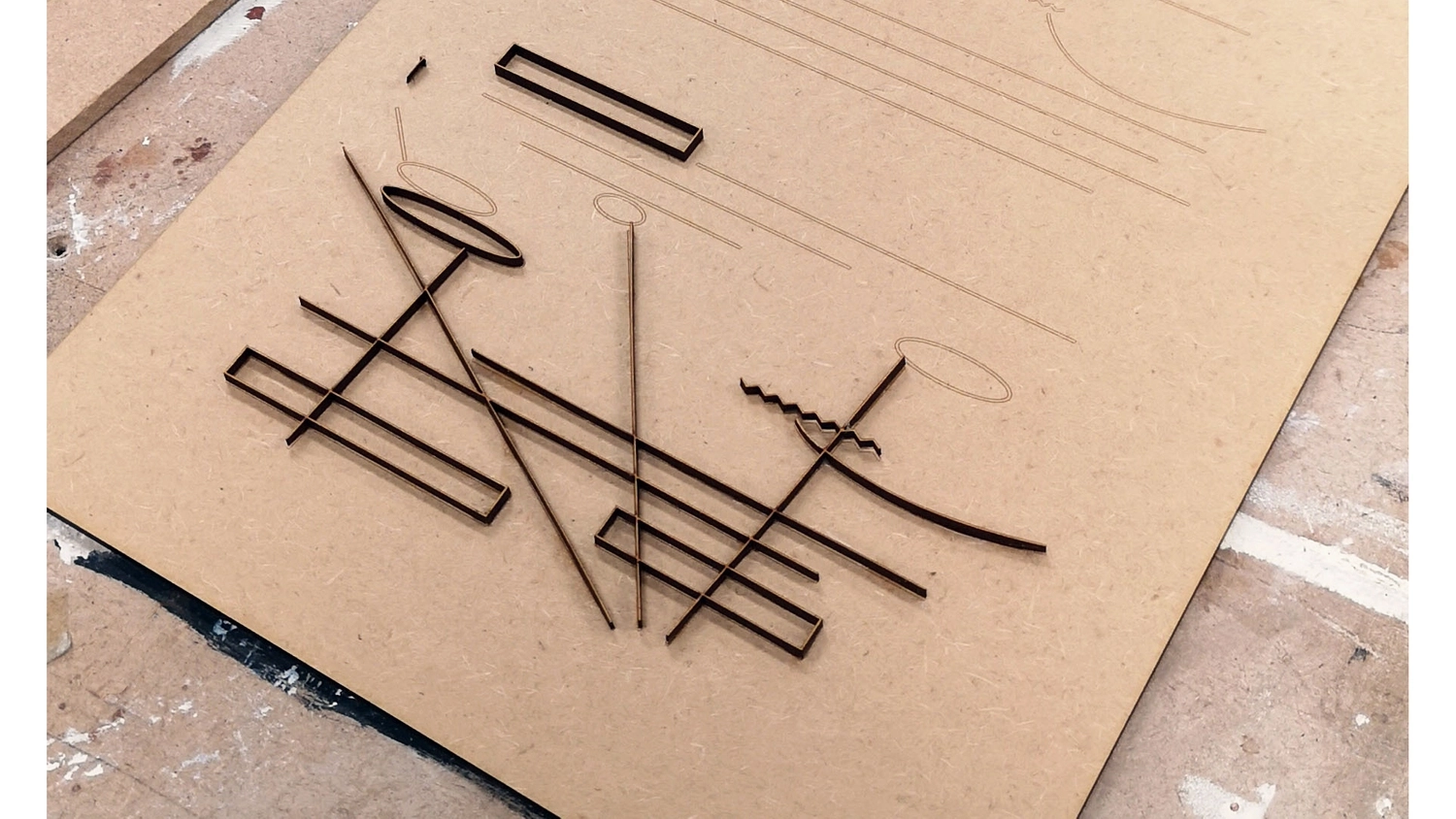
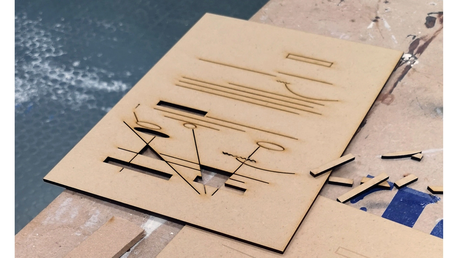
Notation Symbols
I got interested in the idea of trying to print my visual sign language, that comes from my way of taking notes. I thought that it would be interesting to separate text with symbols and examine them individually. This process inspired me to start thinking of language as a material. Thus, I experimented with laser-cut, using MDF board as my primary material. Observing the "gesture" of the two different writing processes (the physical and the technological), I noted a dialogue between them. A symbiosis, where one brings in life the ideas and the other one transforms them into 3D objects.
Konstantina Benaki Chatzispasou
{}
}
{
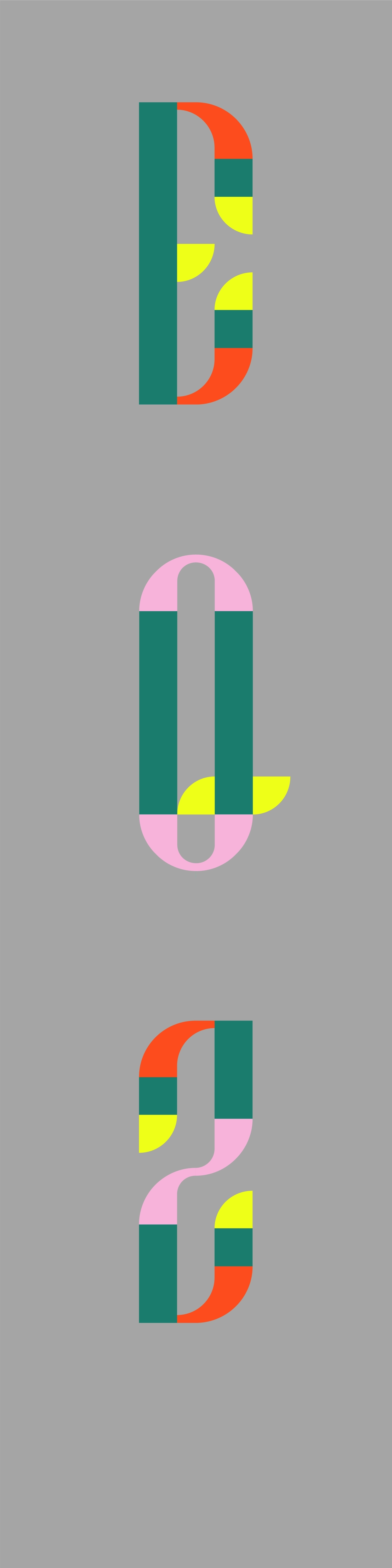
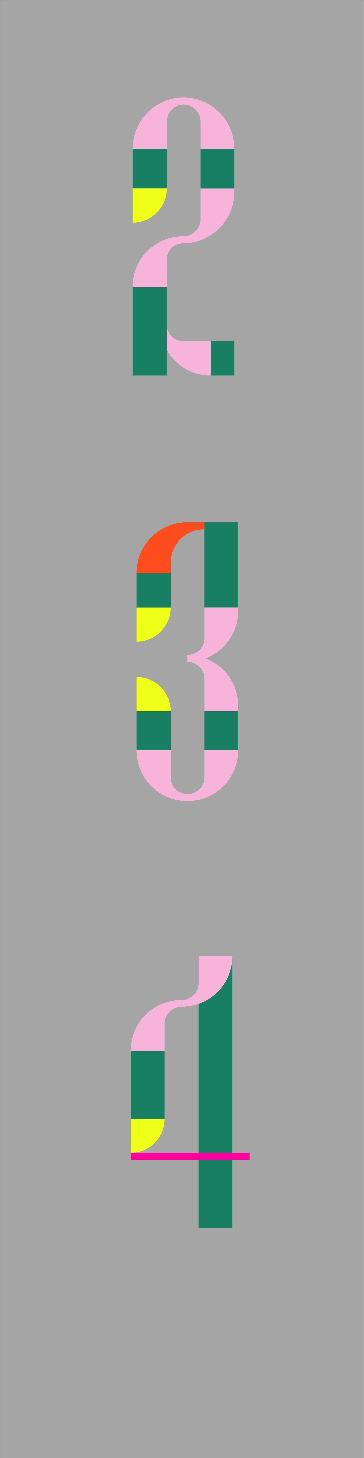
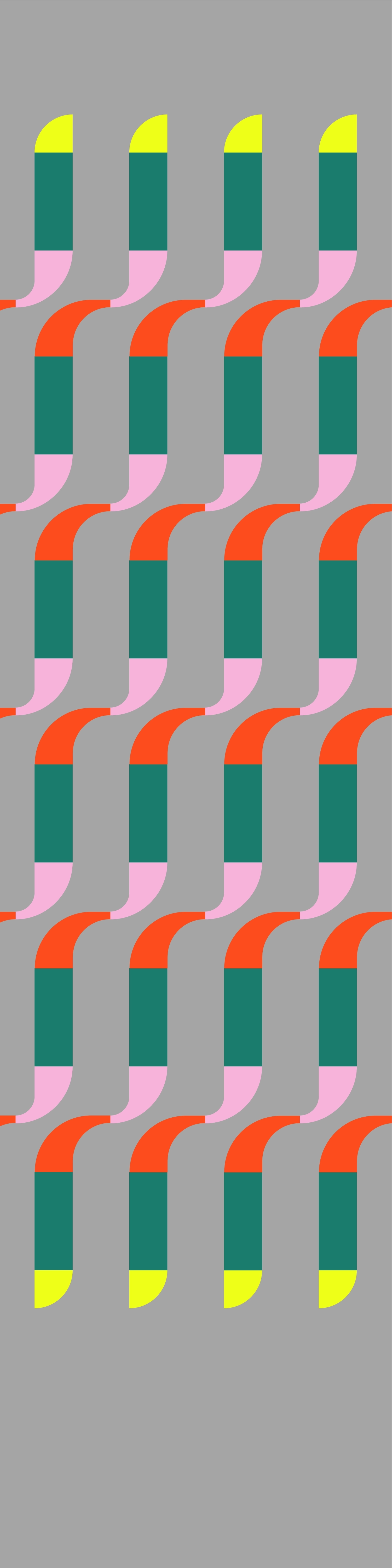
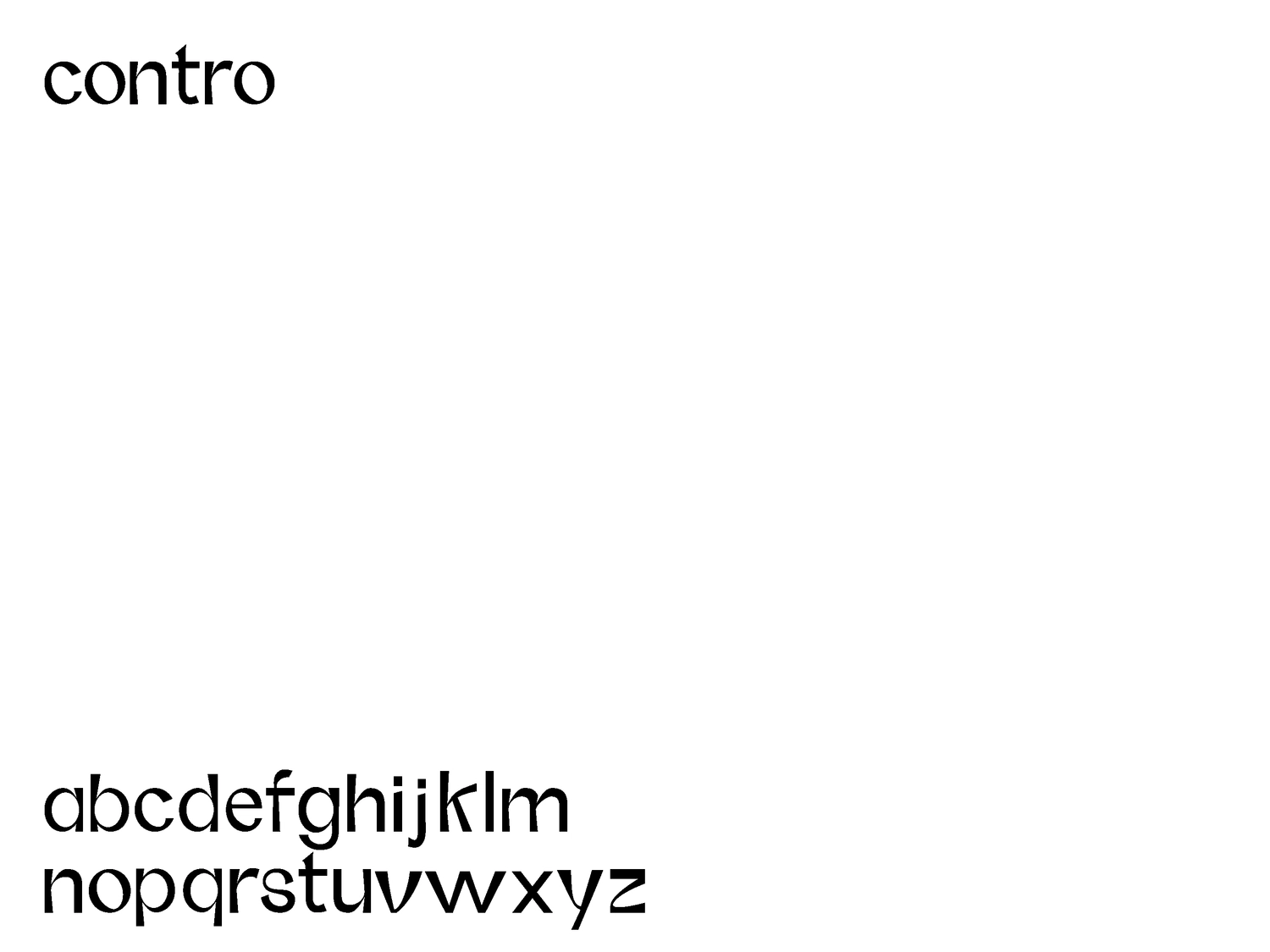
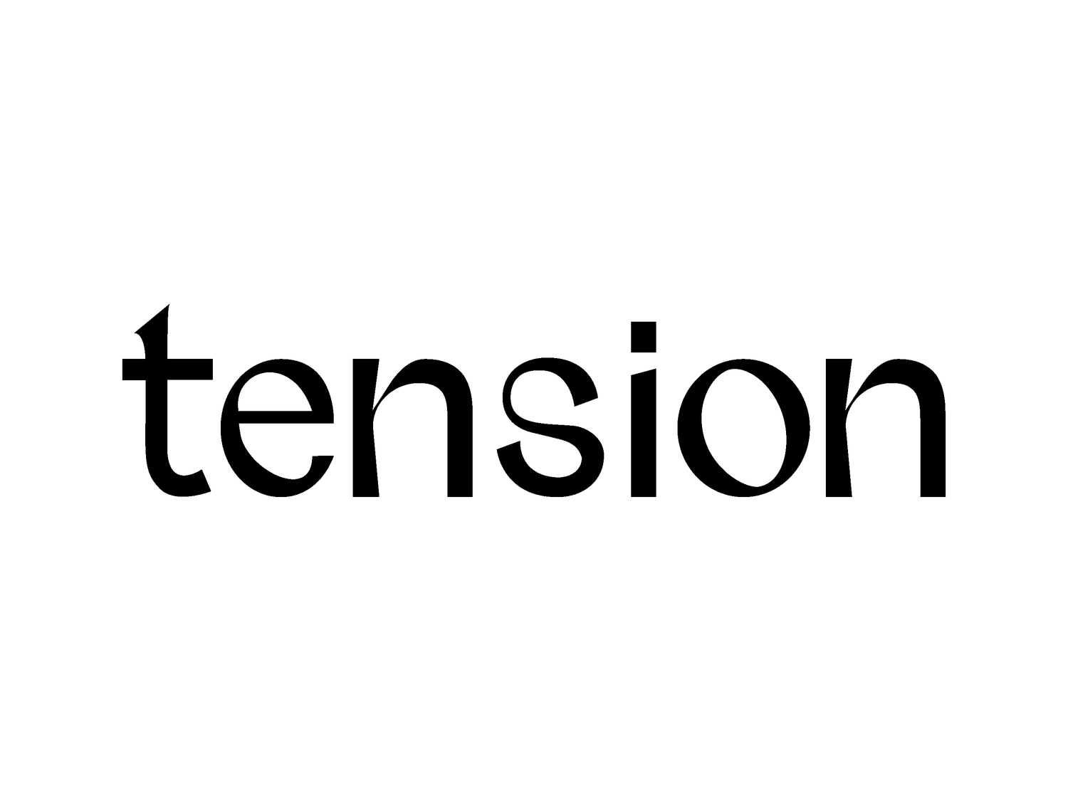
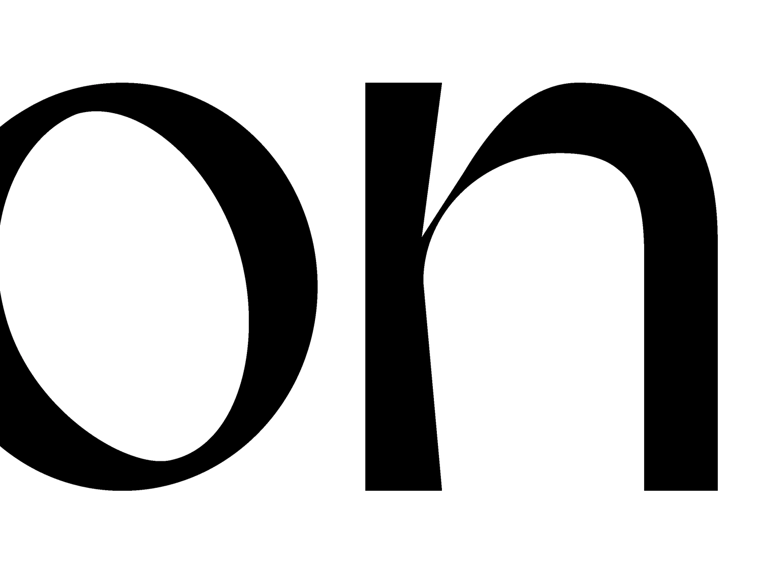
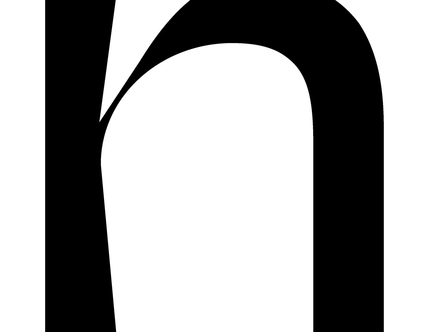
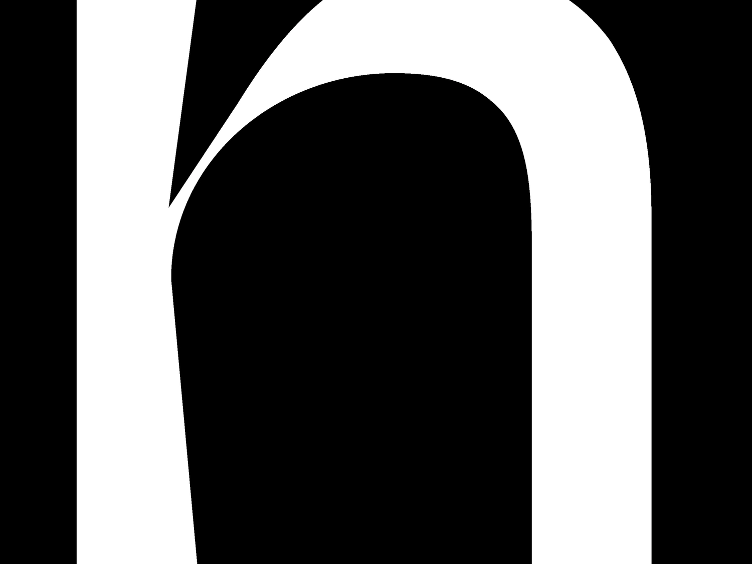
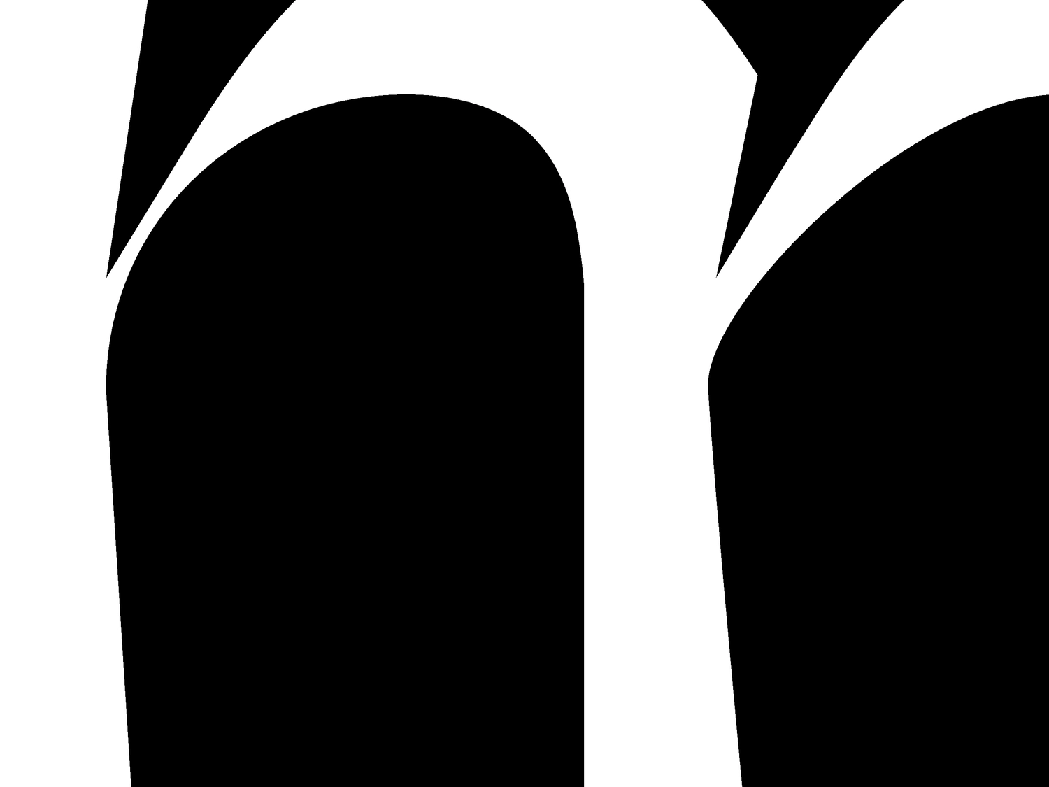
CONTRO WIP
Contro is a work in progress typeface. It plays around the tension of curves and their intersection with the negative space. There is a need of balancing and not-balancing at the same time. A research in progress about the different ways of pulling a glyph in various ways and directions, trying to keep the stability and symmetry.
Magda Tritto
{}
}
{
Grid Type Generator
A speculative font editor/design tool for modular letterforms. Letterforms are created by placing markers on a predefined grid. The system then replaces these markers with geometric shapes to make up the letterform, and exposes controls to transform the shapes and the underlying grid. This was done as part of and ongoing personal project experimenting with home-made design tools.
Max Kohler
would be cool if the modules could be placed by users to create some of the characters, to define a 'style', then propagated across the rest of the set with ML or something
As in the actual placement of the modules would be inferred by machine learning? That would be kind of neat. Style transfer, but for things like counter shapes, proportions and so on.
{}
}
{
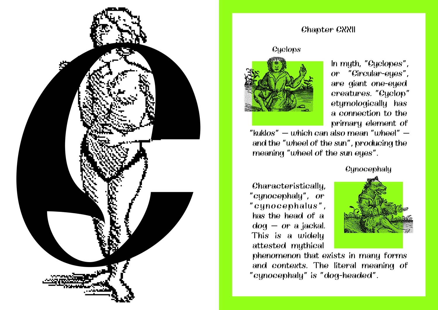
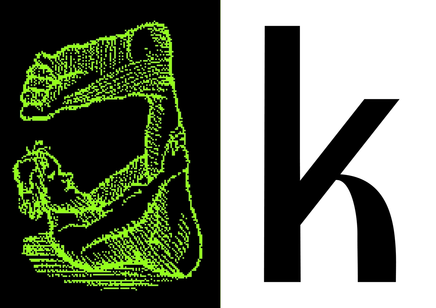
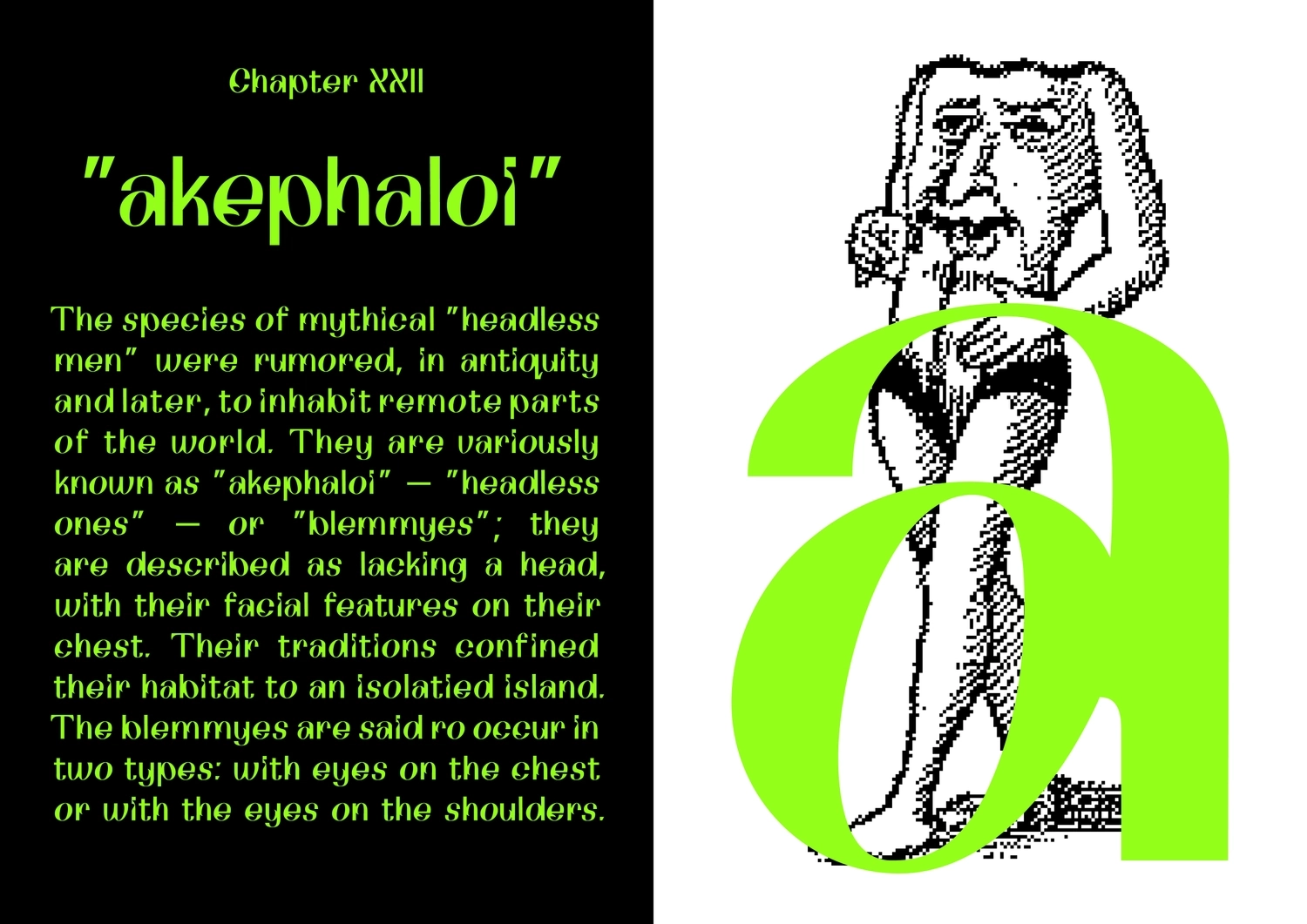
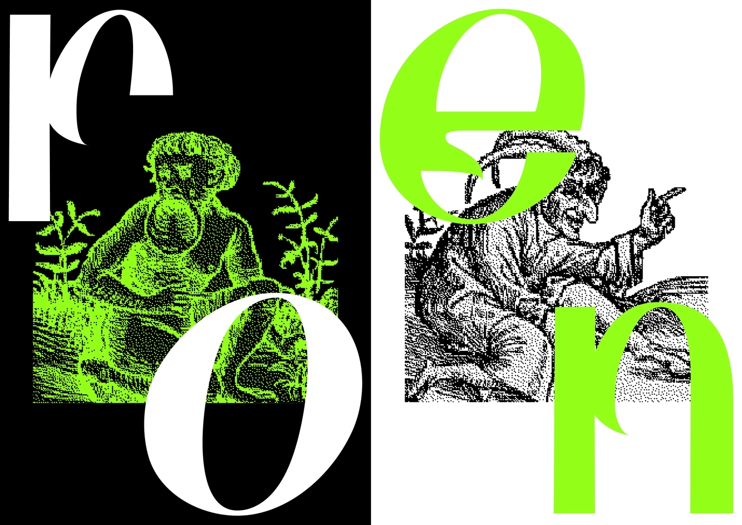
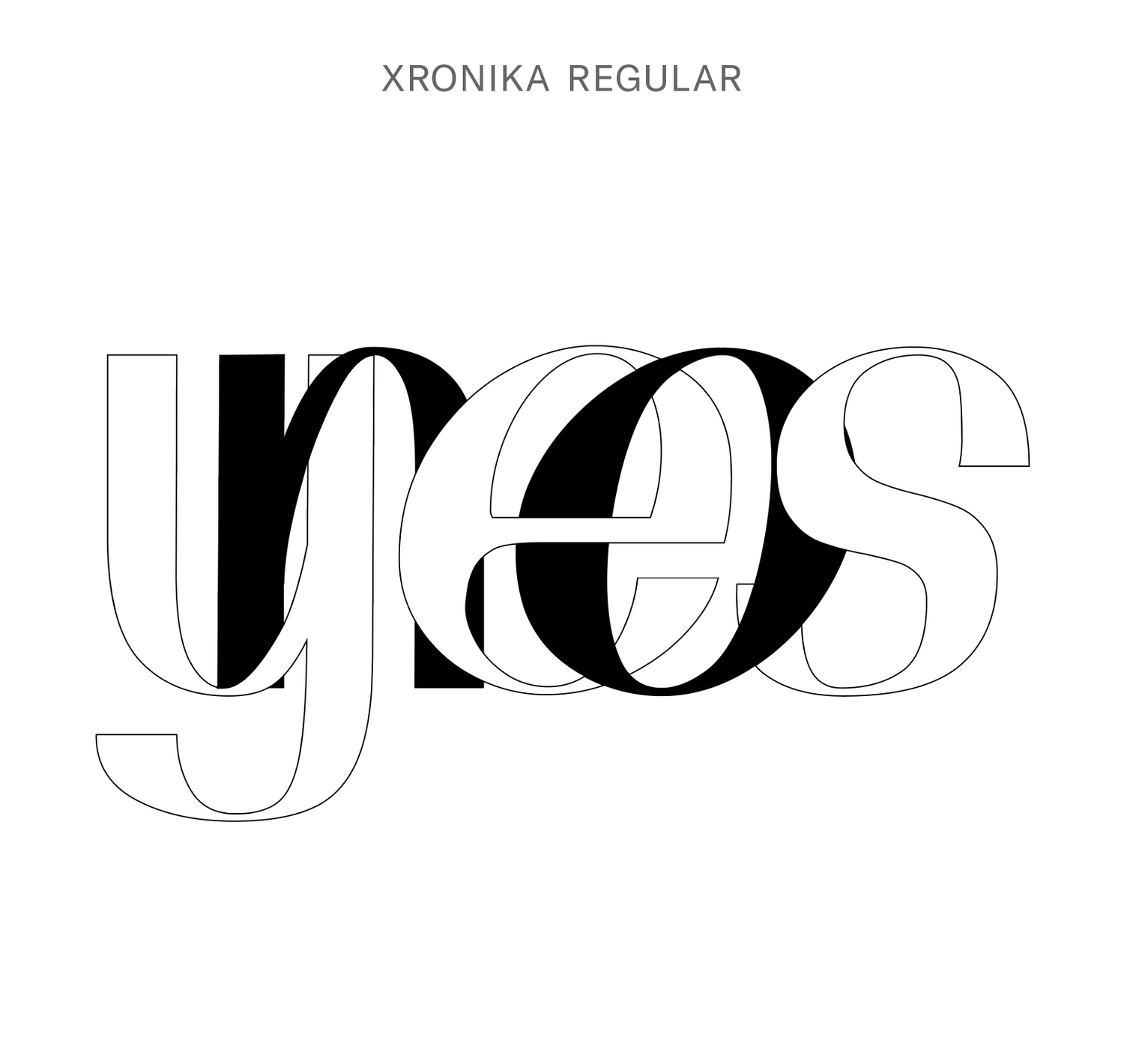
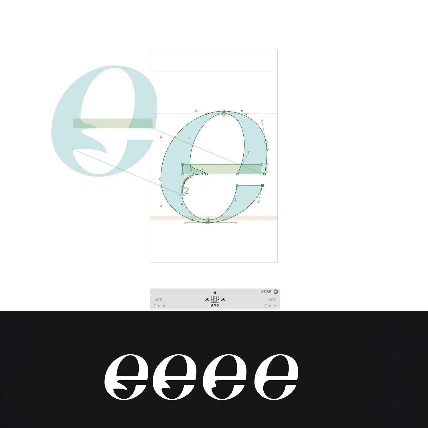
Xronica 2020
Variable font Xronika was born with its tongue out, but since has learnt to tuck it away, depending on who controls the lever. Whilst absurd by nature, it moonlights for more sensible crowds too.
Maya Gulieva
{}
}
{
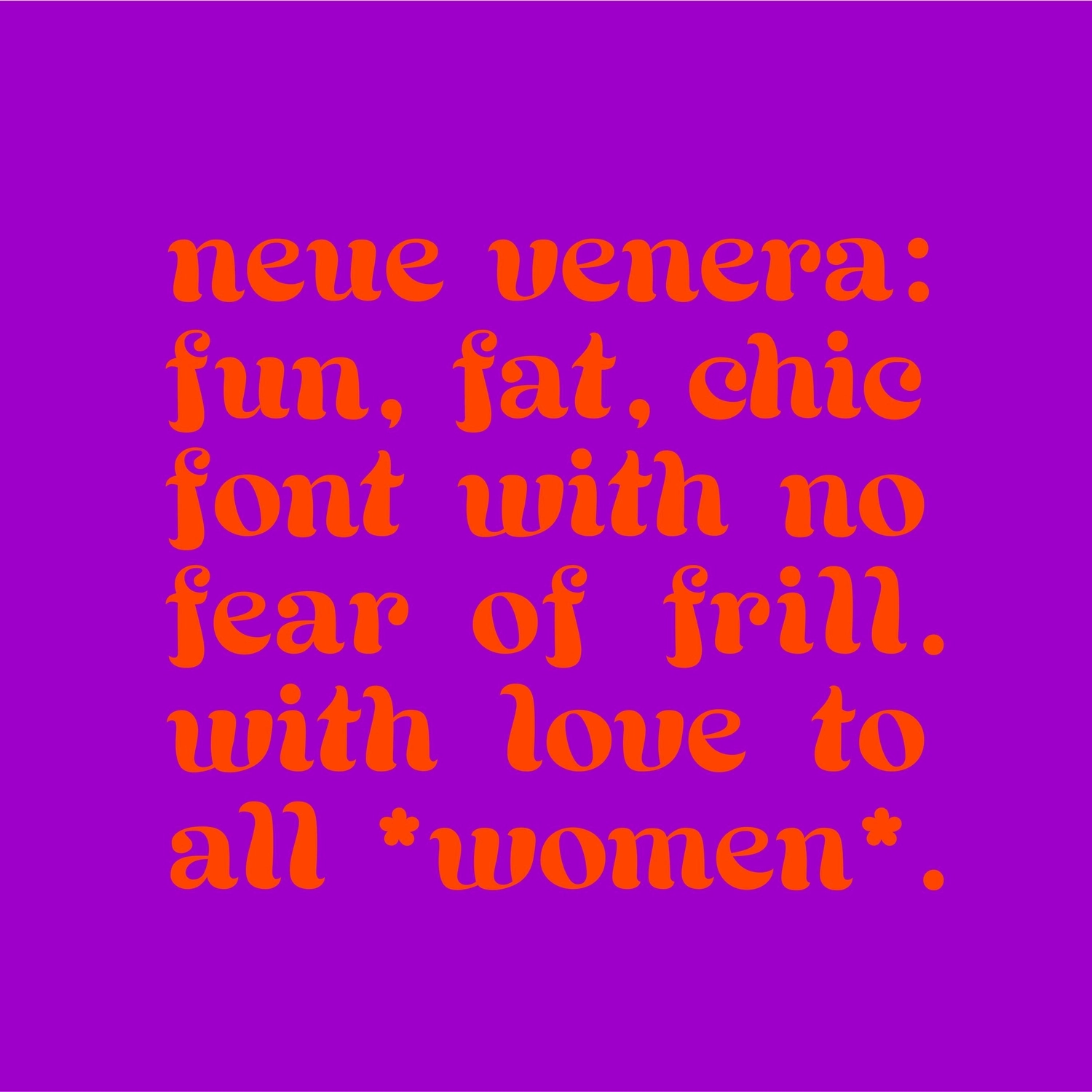
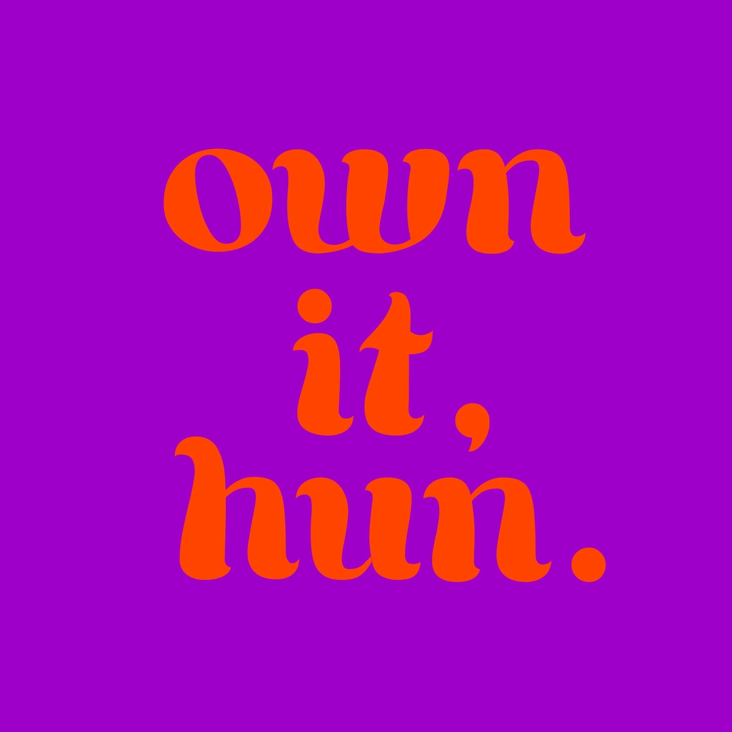
Neue Venera
Neue Venera is a high contrast, round serif typeface, inspired by ITC Tiffany (1974) (basis of Tarantino’s “Jackie Brown”) and ITC Grouch (1970). In essence, it borrows the 70s groove and converts it to contemporary sass. In the way that “Jackie Brown” was a nod to “Foxy Brown”, Neue Venera is a wink to all women.
Maya Gulieva
{}
}
{
Family time
This typeface was created based on a Logo of what used to be my grandfather’s company. I decided to use this family heritage as a starting point for this typeface. My goal was to modernised it as it was initially created in the 60s. This company used to make micro mechanics such as watches. This is why, this typeface has been created as a digital clock, capturing the concept of time passing. This clock takes an hour to be completed, asking viewers to wait. By doing so, it puts into question our current relationship and understanding of time.
Meli Berney
{}
}
{
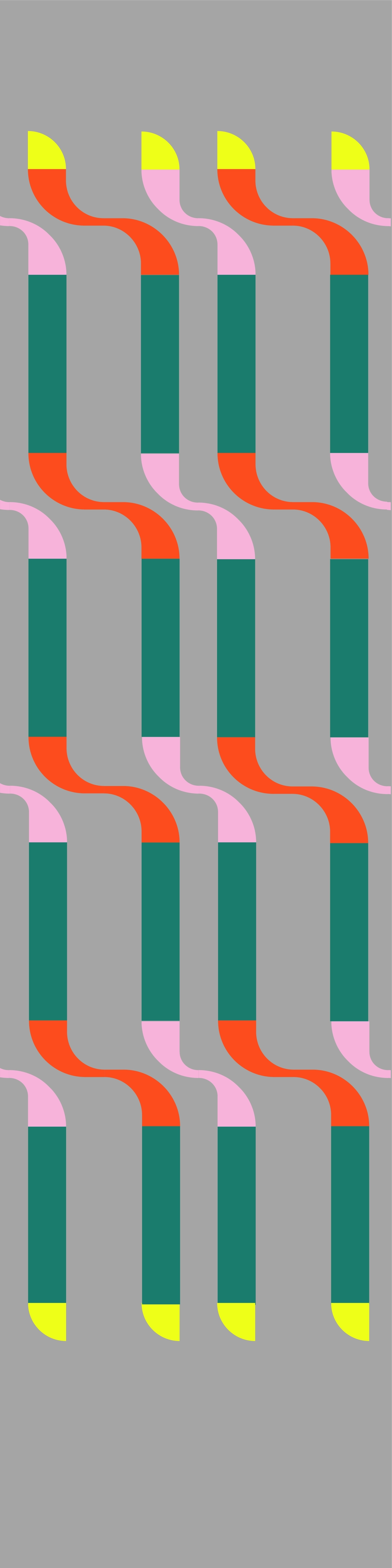
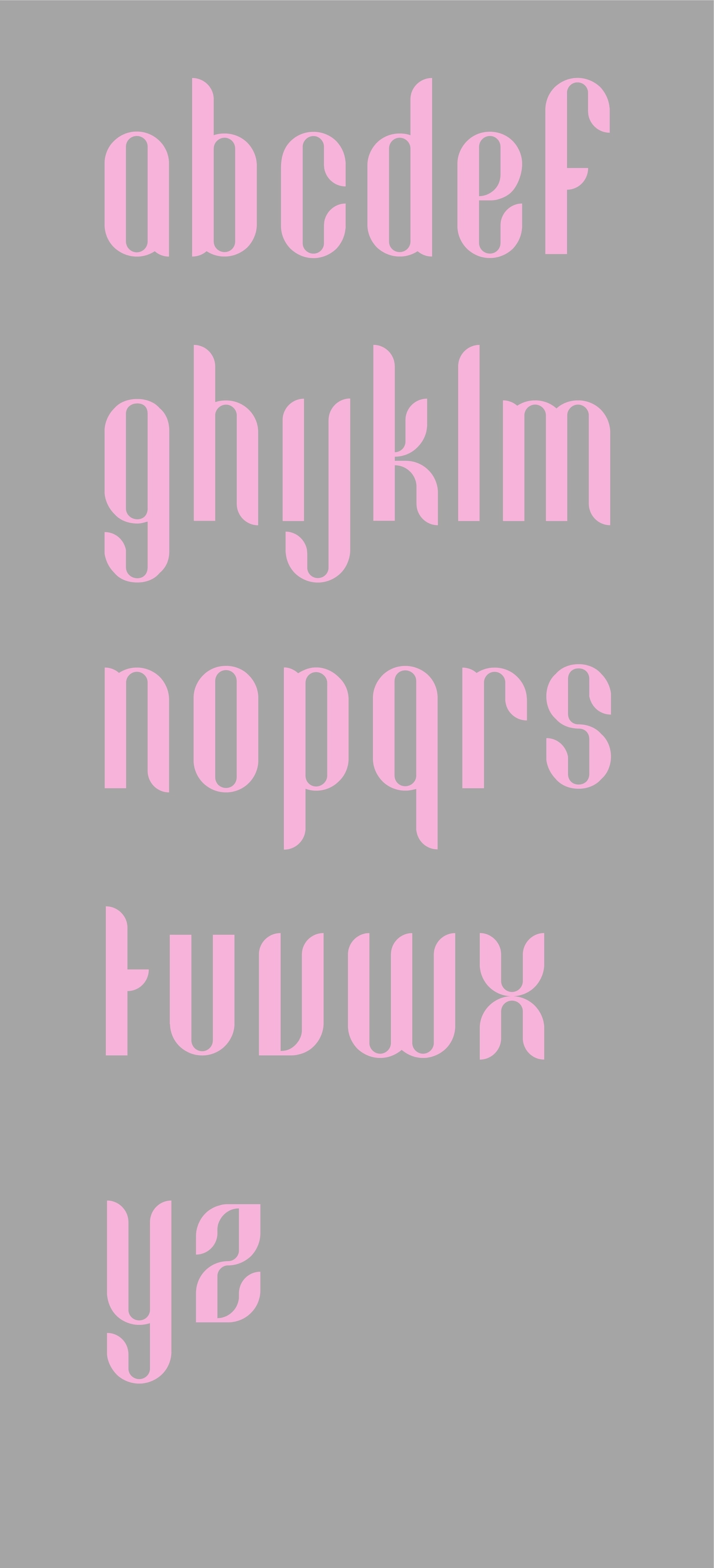
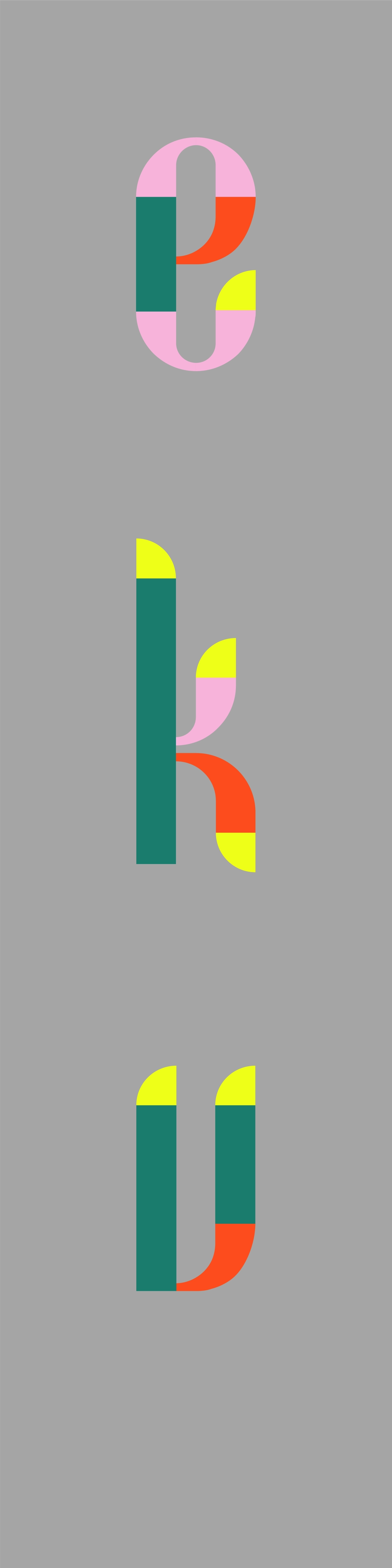
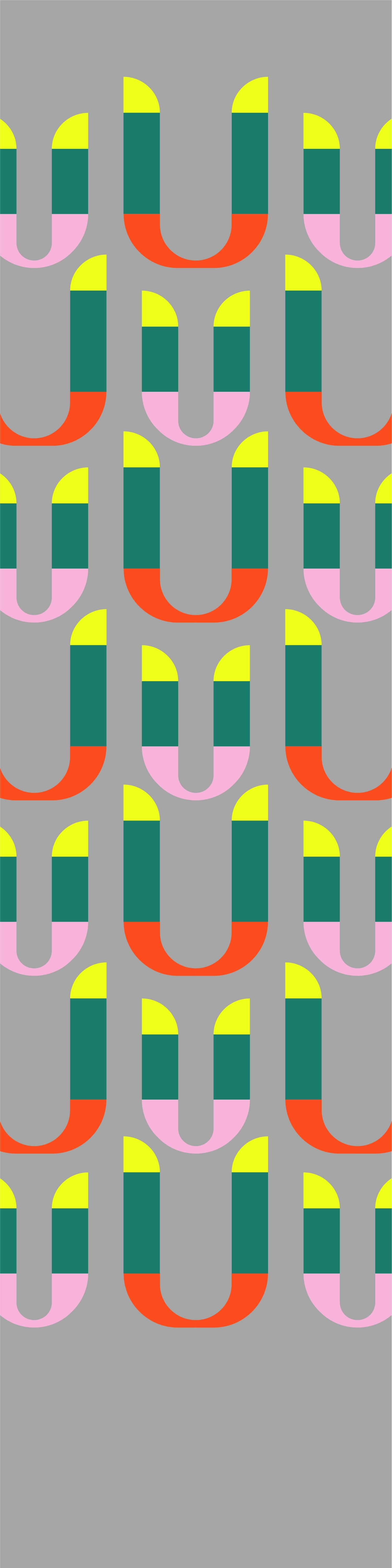
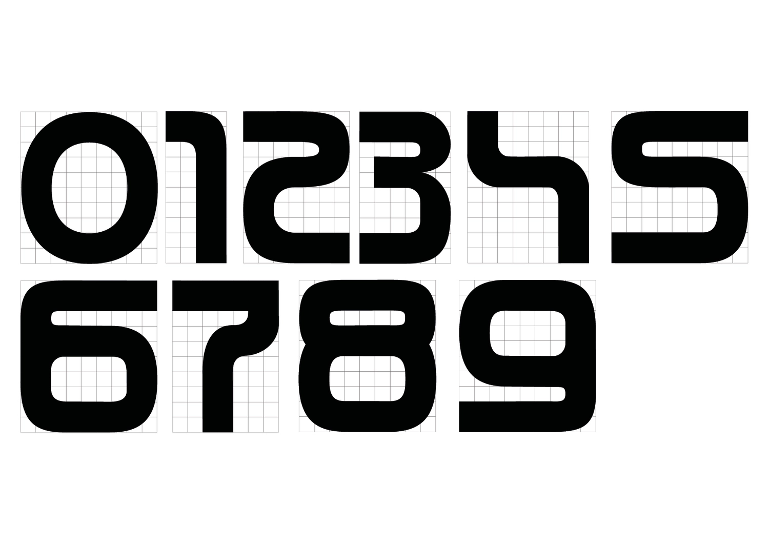
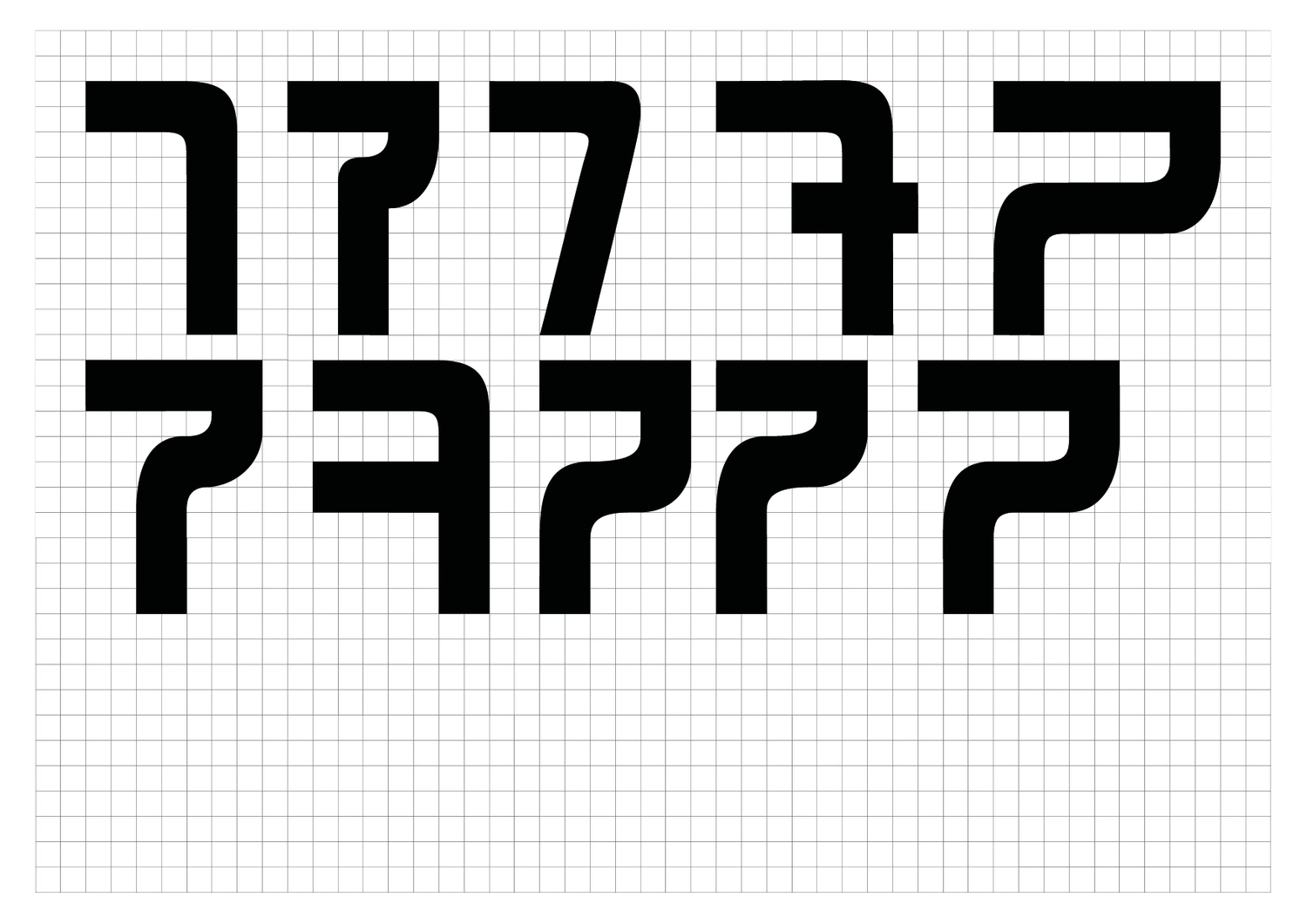
Stack
Stack is a modular typeface which can be combined by a user. Pressing keyboard buttons from A to Z allows each of the modular strokes to be stacked as a full letter. Each stroke has its unique geometric pattern, and users can combine strokes to create personal characters. Each stroke can be adjusted in weight and shape by the user. It can be adjusted separately by stroke or the entire letter at once to create individual typeface.
Minjeong Kim
{}
}
{
Pocari Sweat
A live stream of a cold can of Pocari Sweat.Pocari Sweat design by Helmut Schmindt, 1980.
The letterform in this work was created using instagram editing tools and the screen record function on a smartphone.
If I was going to post rationalise my efforts I would tell you that I was interested in creating something that replicated the performative aspect of looking through the archive; by clicking though endless boxes to discover something that was made by using basic software that most people have access to via their phone one could read as being a wider comment about the exclusivity of design education and the expensive software needed to make type, which it does, in reality it was just me experimenting with the functions on my phone whilst using the visual language of a how-to video to create a playful intervention in this open call.
Roland Ross
{}
}
{
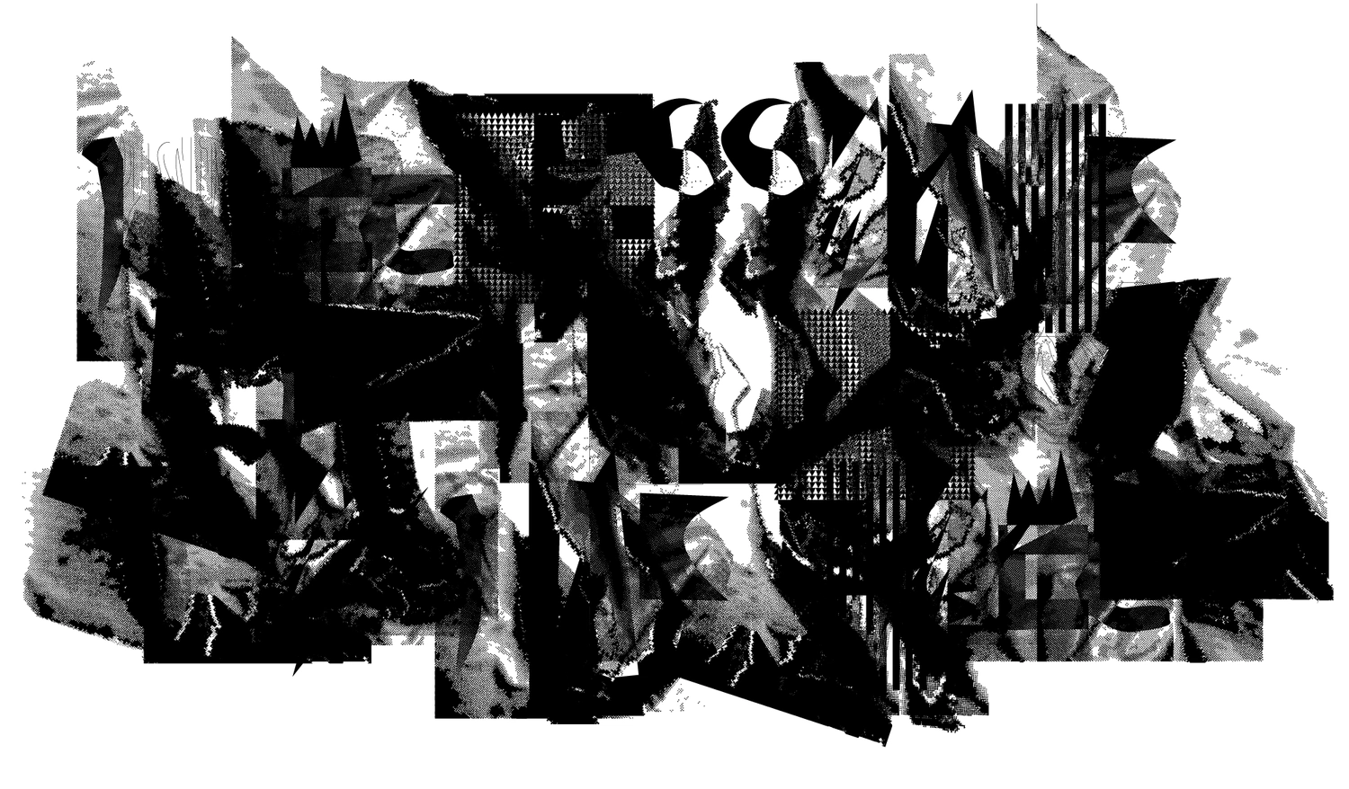
Cartographic Typography
Typography is traditionally read as two-dimensional forms inscribed on a flat plane. Cartography is the two-dimensional representation of three-dimensional landscapes on a flat plane. By using techniques inspired by cartographic ways of working such as line weight hierarchy, contour lines, density, patterns and halftone effects, this body of work aims to challenge the viewer to interpret this new typographic landscape as a two-dimensional representation of space. This landscape suggests layers and also shows depth through the positive and negative spaces.
By using Glyphs as the tool for production, each letter holds its own “data”. Once glyphs are combined side by side, we see overlaps and inversions happening between combinations. This quality adds to the abstract quality of this work, making the written content completely illegible.
Sean Steed
{}
}
{
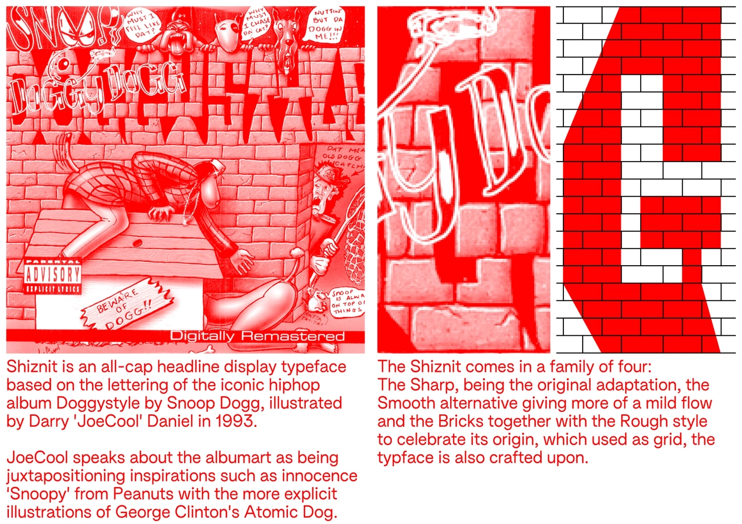
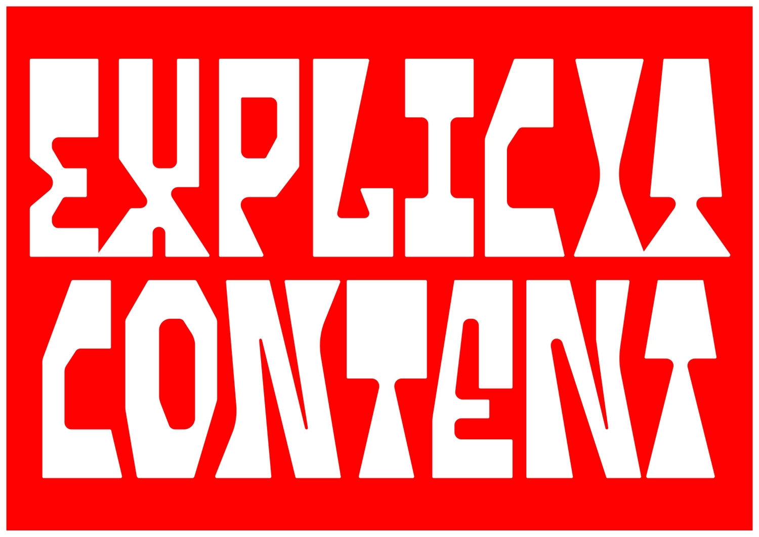
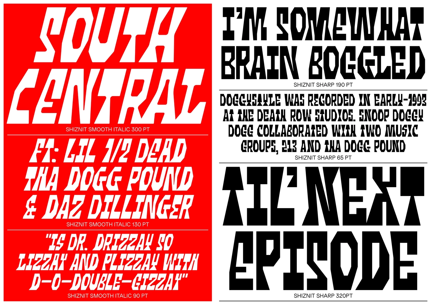
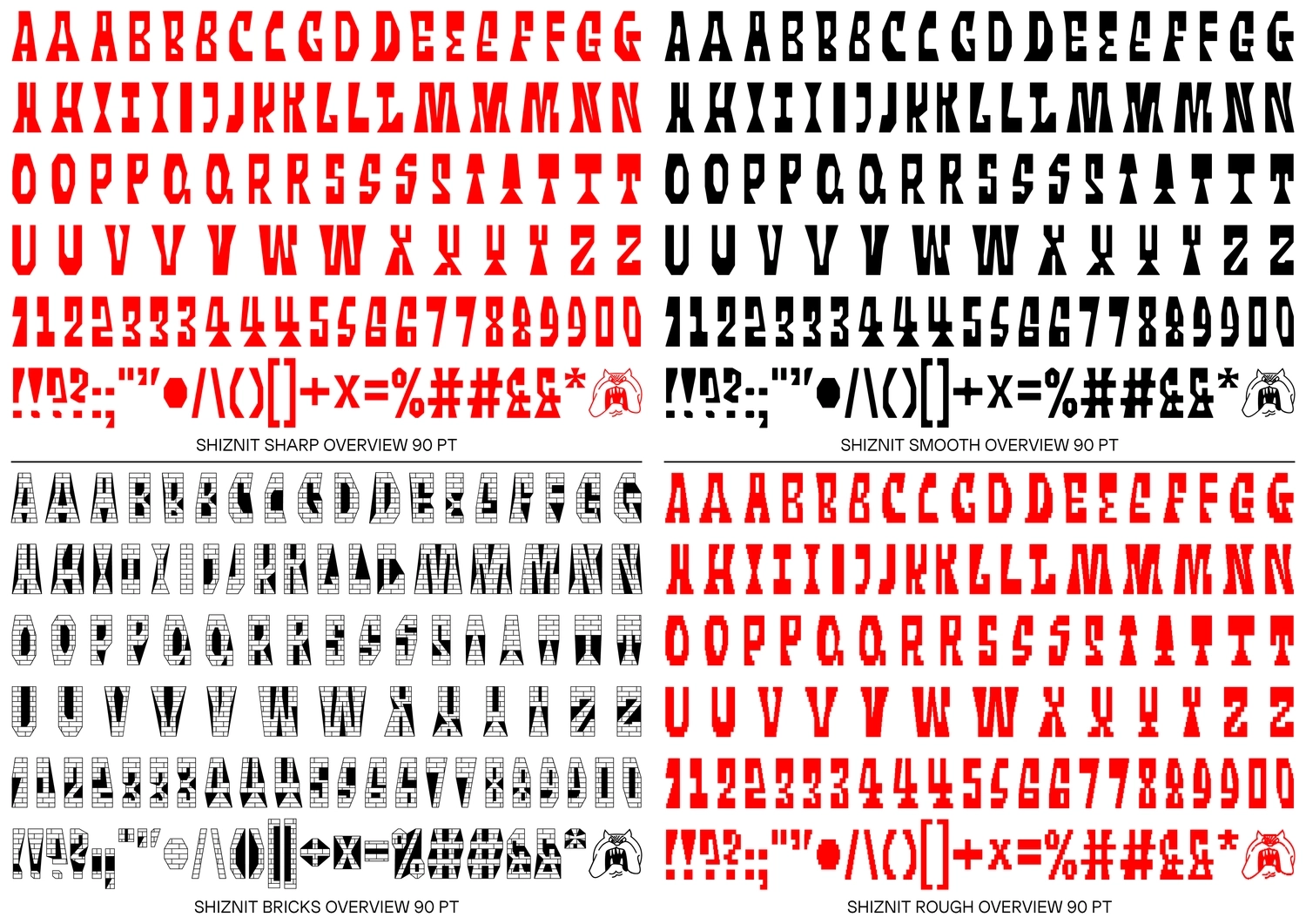
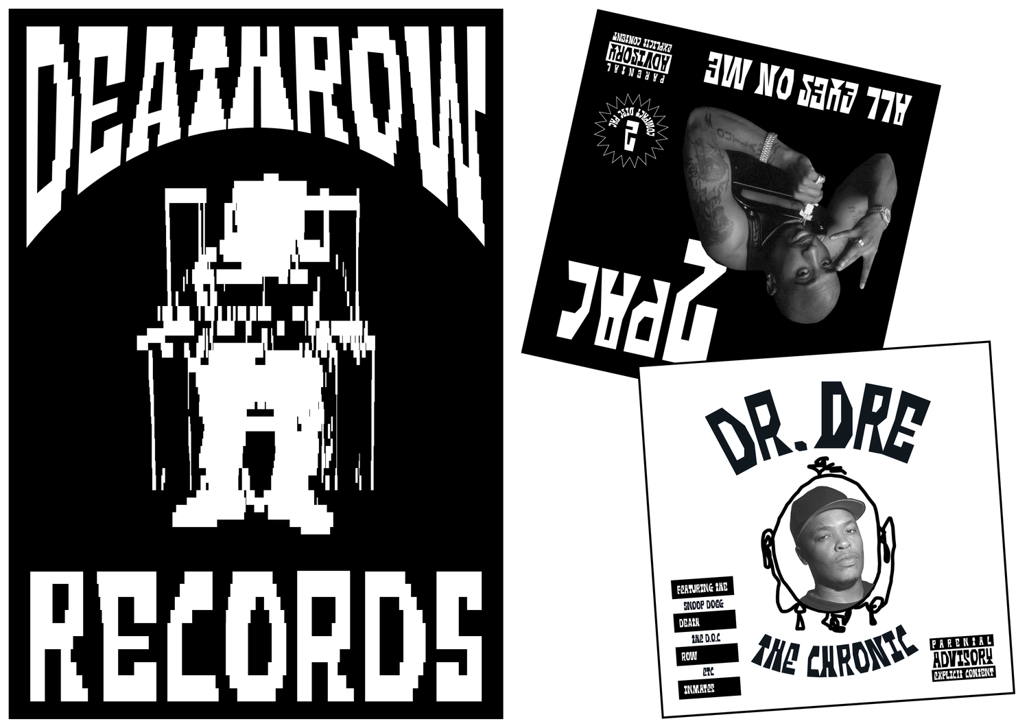
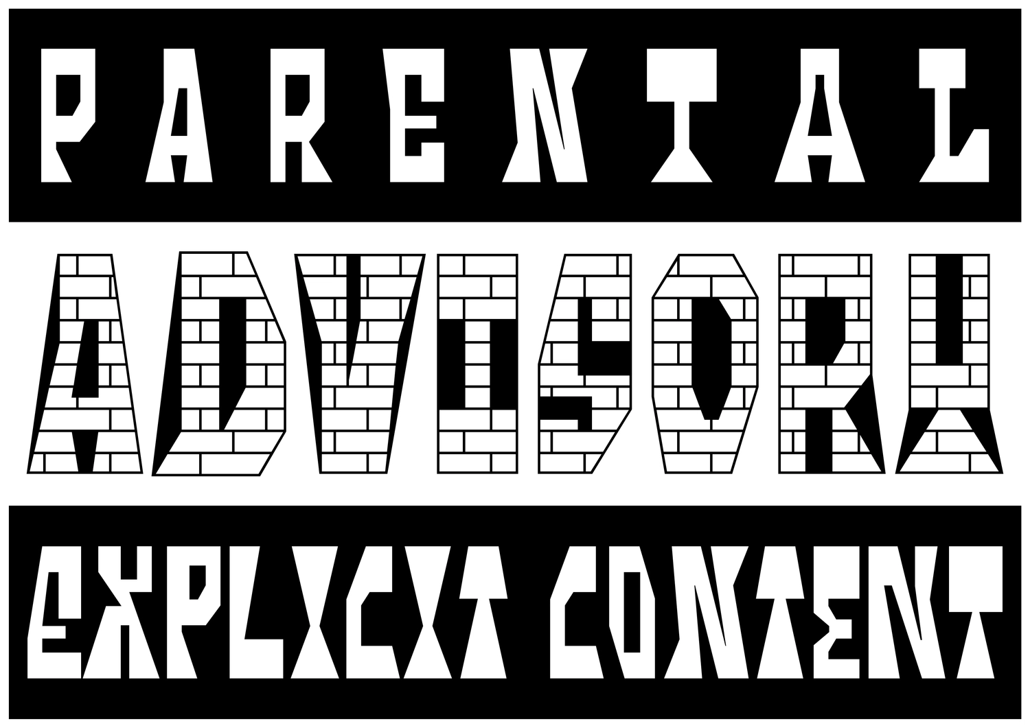
Shiznit
Shiznit is an all-cap headline display typeface based on the lettering of the iconic hiphop album Doggystyle by Snoop Dogg, illustrated by Darry ’JoeCool’ Daniel in 1993.
JoeCool speaks about the album art as being juxtapositioning inspirations such as innocence ‘Snoopy’ from Peanuts with the more explicit illustrations of George Clinton’s Atomic Dog. The Shiznit comes in a family of four: The Sharp, being the original adaptation, the Smooth alternative giving more of a mild flow and the Bricks together with a Rough style to celebrate its origin, which used as grid, the typface is also crafted upon.
William Jacobson
Snoop would be so proud, ace project!
{}
}
{
Results Confidence
Say Something
With the growth rate of voice-user interfaces, I was intrigued by how confidence in personalities like Alexa or Siri was expressed.That's why I decided to use Google's voice recognition technology to create a web page that presents the level of confidence of a "software".When the user speaks up, if the "software" is fully confident that it has understood his words, it will write it in the yellow color. If it is not sure, it will write it in the blue color, so that eventually a color distribution of the software confidence level is obtained.
Yehonatan Cohen
{}
}
{
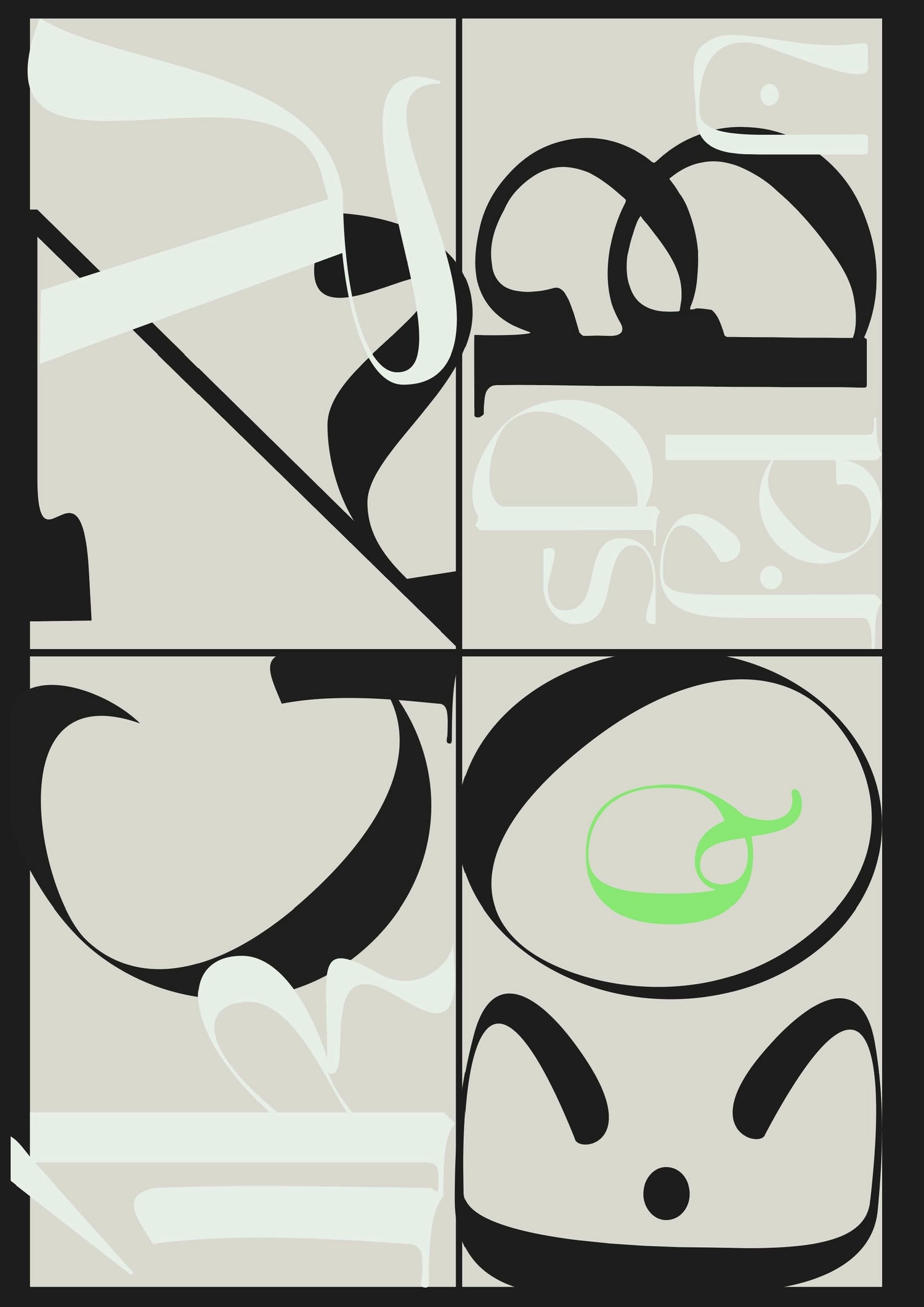
Index to Image
Over the course of 18 months at the RCA I designed 12 posters advertising various events. With our time at the RCA having come to a sudden and unceremonious end they are now a bittersweet reminder both of what was and what was still to come. As with any poster past its event, they are no longer a signifier – dates and locations are nothing but empty type. I printed layers of each poster on top of each other on my printer, creating nonsensical posters whose previously indexical type has become nothing but image. The result is a shell of an experience, somewhere between taunting and comforting.
Emily Schofield
{}
}
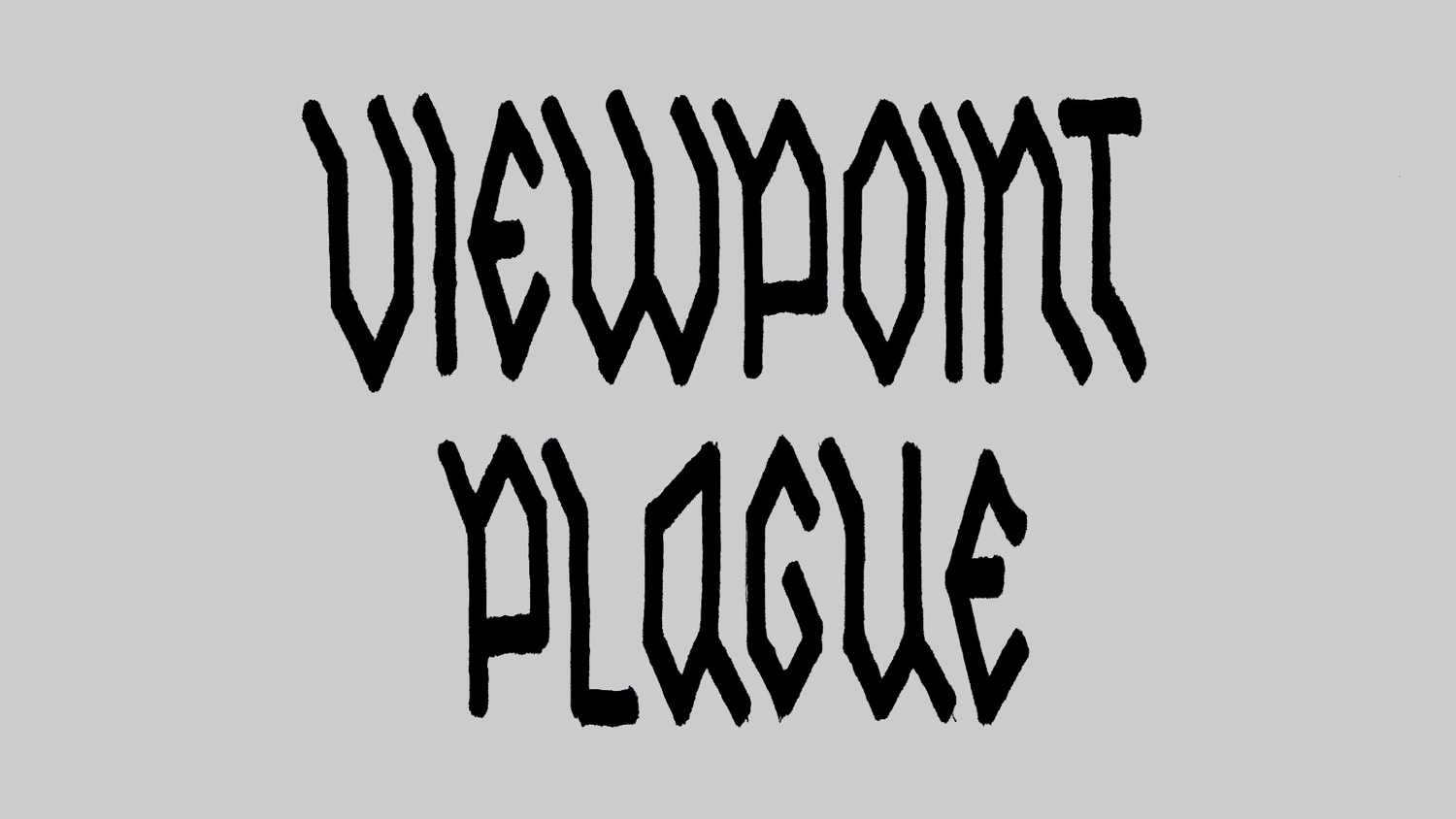
{
Grotes\<
There is arguably no need for any new typefaces and perhaps more excitement is gained from hacking and rearranging existing ones. I rearranged the glyphs of an existing typeface, using kerning and baseline shift, then recreating from the original glyphs file, to create alternative lower case letters. Using Neue Haas Grotesk allowed for a really interesting contrast between the original letter forms and the angular, sharp, off-kilter ones created from the glyphs.
Daniel Johns
nice
{}
}
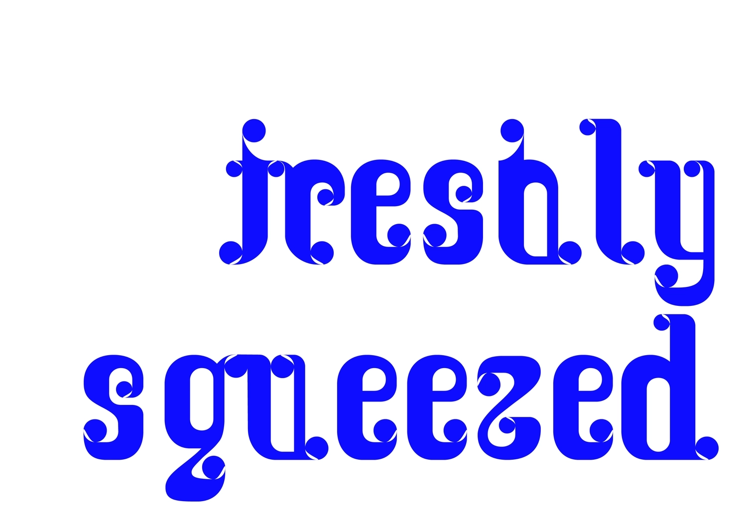
Melting Time
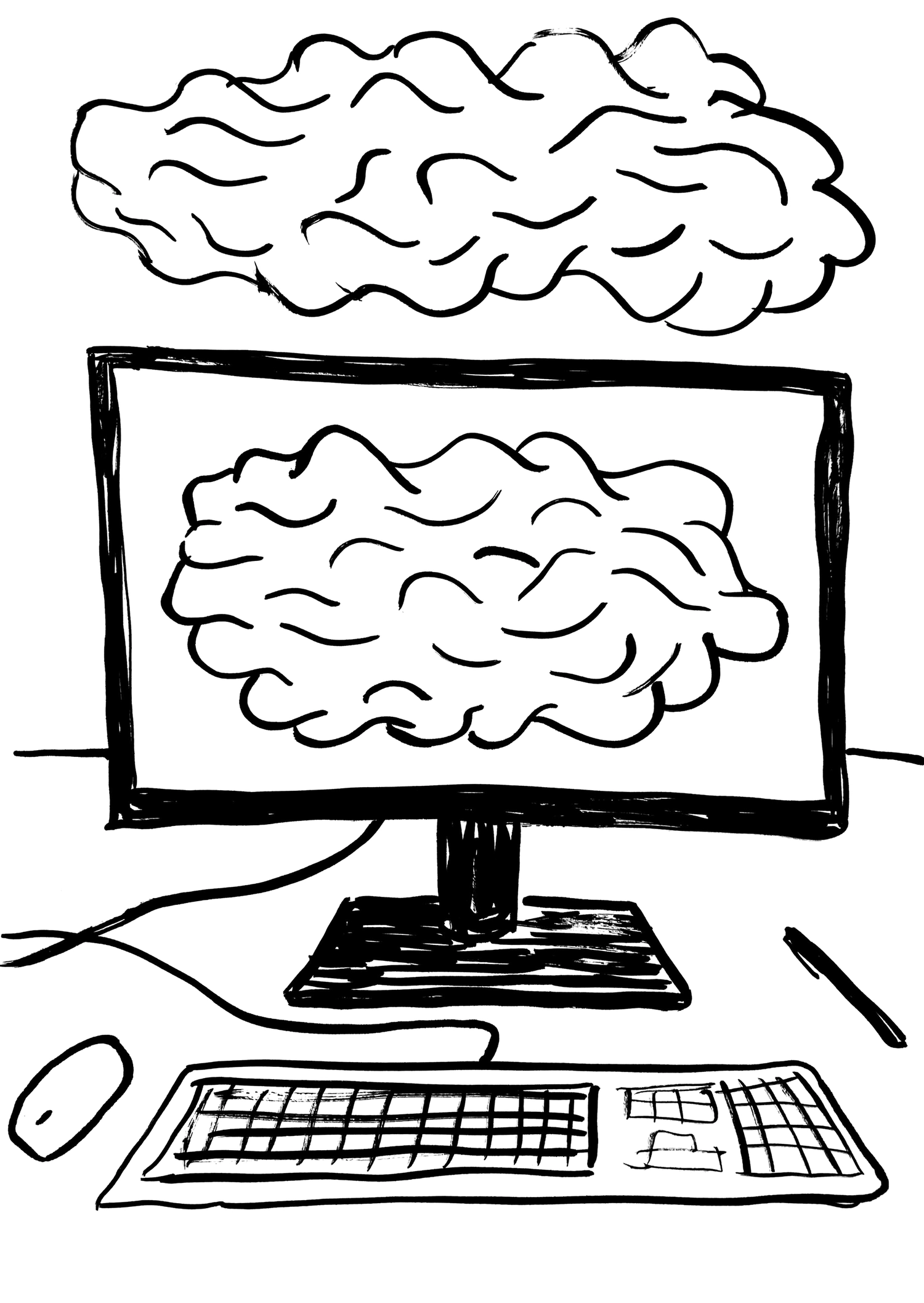
During the period of the pandemic things feel a bit different. Time seems to have stopped even if it is still rolling. Your body is stuck in a room but your mind is still travelling around. Feeling a bit lonely but at the same time “surrounded by yourself”. An inner self endoscopy. Exploring the actual value of life, learning how to appreciate simple things that were taken as granted even if there are not. Traveling through a nostalgic dream of the past and some hope for the future. From the “robotic” past to the adjustable present. Time feels like melting.
Tina Touli
This image, is one that I've been contemplating for the last few months. It's a plate from "Communes in the New World", a book published in 1972, written by Liselotte and O.M. Ungers. The project was a broad sociological and architectural study of communal societies in America, from the 'founding' (in the white colonial sense) of the USA to the hippie movements of the 1970's. The yin-yang describes the beliefs which scaffolded most of those communities: a return to the balance between nature and man, and equality between all individuals.
Today, with much of the world literally and figuratively on fire, it feels important for me to share this image and consider the future it proposes. How, in this time of isolation and distance, can we become united in our purpose? How can this image can be transformed, made real? And, if another world is truly possible, what are we willing to do and risk, personally, professionally, to achieve this future?
Seb McLauchlan
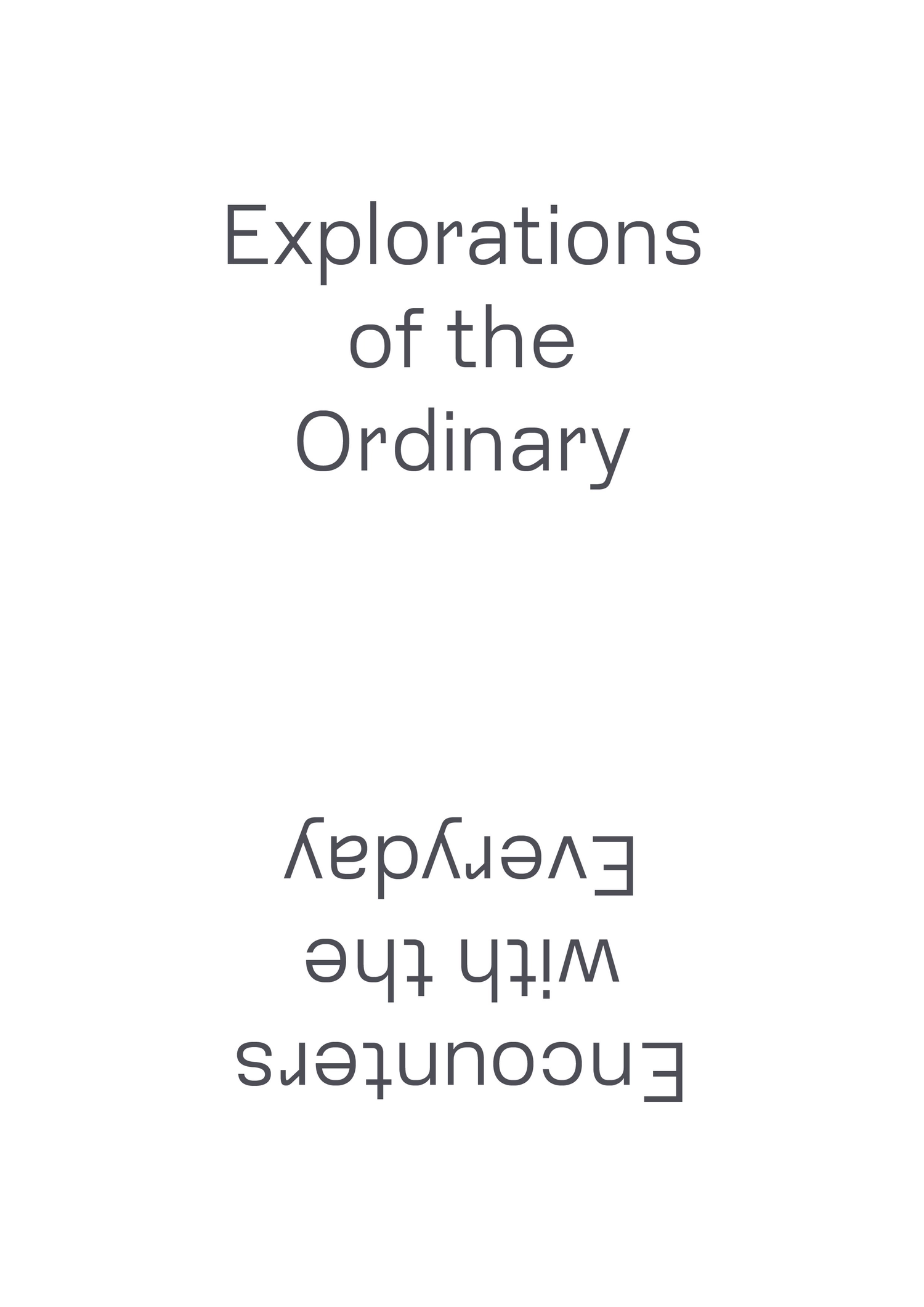
Typefaces and vernacular lettering convey a sense of ‘everyday’ familiarity through the recognisable commonalities of their forms, and their common use and reuse can cause them to trigger unexpected associations, feelings or memories. These consequences reverberate through the different contexts in which they appear, contributing layers of meaning which multiply through each encounter–both in the work of their creators and through their appropriation by others. As visual practitioners and type designers, we engage with both the accumulation and the creation of graphic readymades in our physical, virtual, literal and metaphorical movements through the environments of everyday life.
A Practice for Everyday Life
Walking to my studio in East London. It takes 45 minutes. Is the time running slow or fast?
Time to draw. Unable to focus on something concrete.
Ok, let’s start all over again.
Radim Pesko
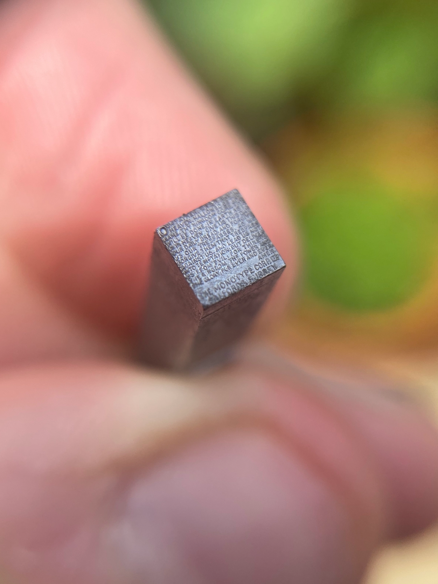
In the days when Monotype was still synonymous with hot-metal (with the casting of lead type) the corporation set out to show the extraordinary accuracy of their machinery and demonstrate the detail that could be achieved through its operation. As an illustration they produced and distributed single 12pt sorts* which appear, at first glance, to be blank but under closer inspection (and magnification) in fact display the entirety of the Lord’s Prayer, cast onto the face.
It seems impossible, miraculous even (certainly transcending human scale), but in fact The Lord’s Prayer Em stands testament to precision engineering—a mastery of materials and the tools which shape them.
As a piece of printing-type, however, it is useless. Under pressure the minute marks would never hold the ink. The simple fact that it is right-reading further evidence that it was never intended to be used, per se, but was an outcome in and of itself. And so, with workshops closed or inaccessible, and thus the metal type held in college collections up and down the country (and across the world) sitting mute in cases, I’m trying to take some solace in that fact, at least.
*The specific typographical term for an individual piece of type.
Robert Hetherington
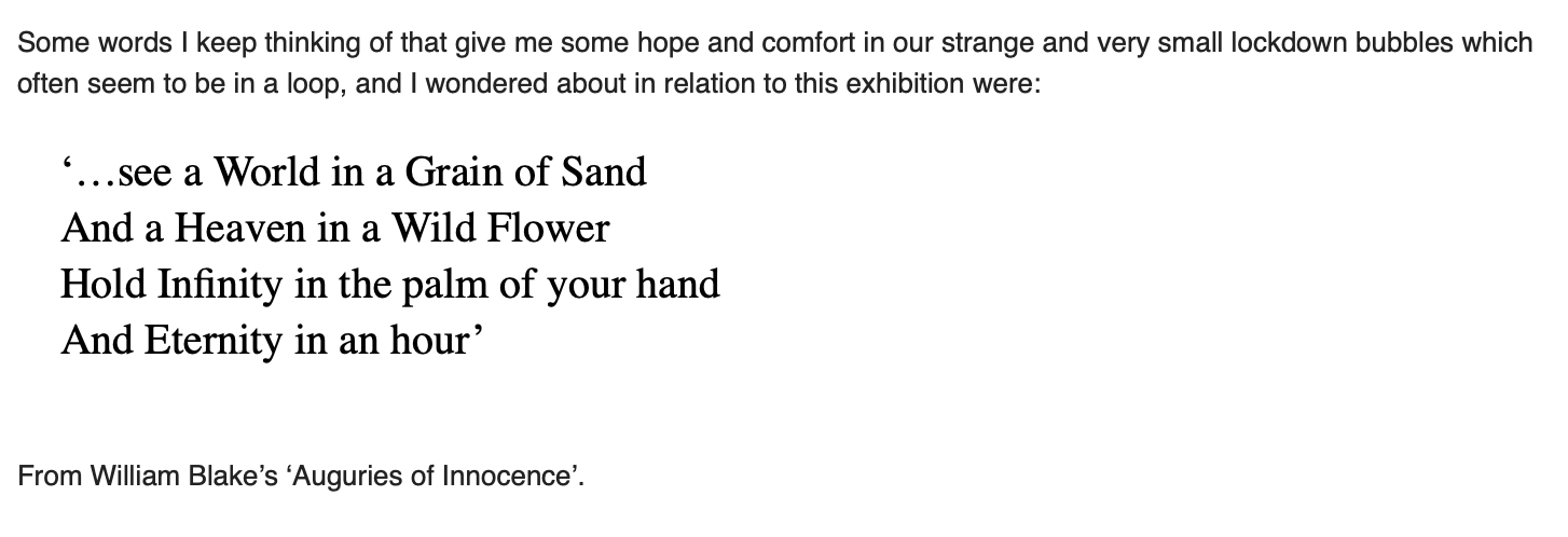
Some words I keep thinking of that give me some hope and comfort in our strange and very small lockdown bubbles which often seem to be in a loop.
Amelia Noble
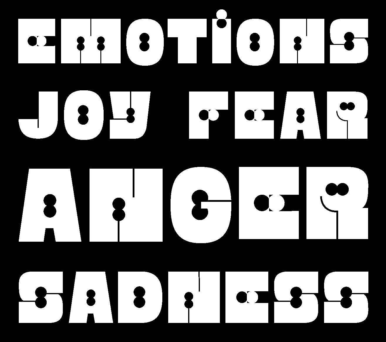
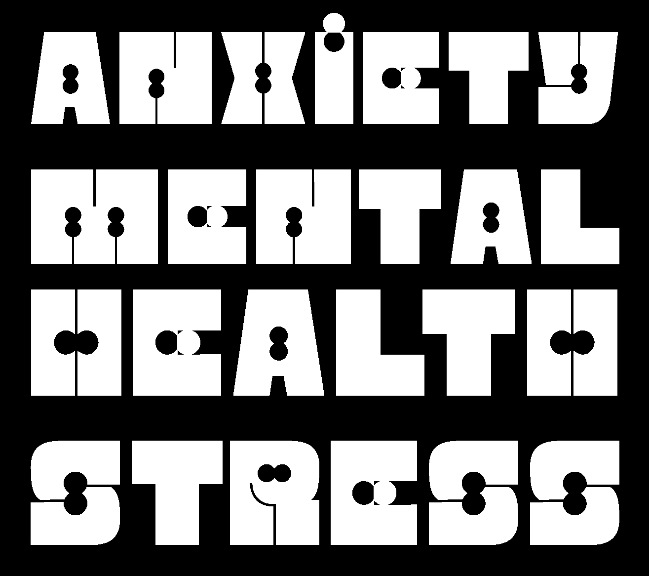
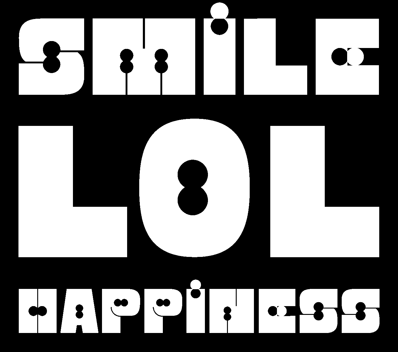
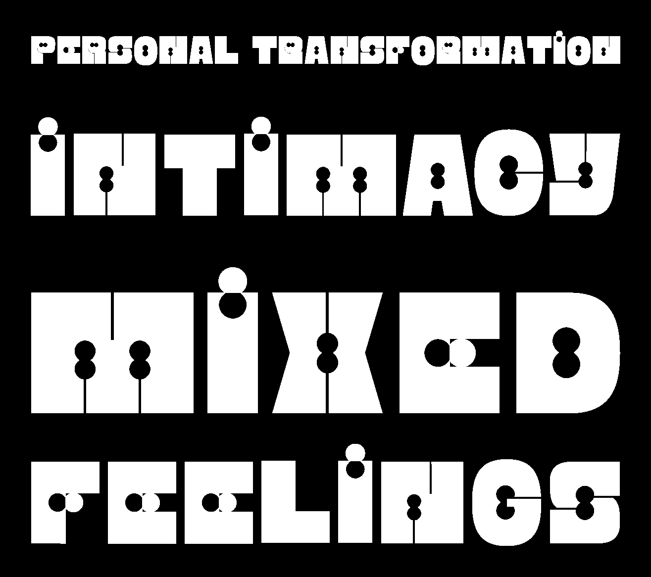
For a while now I’ve been interested in designing typefaces that are inspired by human emotions and the forces that move our psyche. In my typeface Kafa (Arabic for enough), I channeled my anger towards Donald Trump’s policies in the Middle East in order to create a protest poster that I took to the demonstration in London. Last year after my dad passed away, I started another typeface called Sawad (Arabic for blackness) in which I explored my feelings of grief and loss. This poster here shows an unfinished typeface that is inspired by an Arabic song about heartbreak and the wounds of love. It draws the bleakness and agony of separation and the knives that course through a broken heart.
The design of the typeface is inspired by the Sudani calligraphic style and is drawn in a very organic and imperfect manner and is meant to feel raw and unpolished. The exaggerated and sharp diagonal descenders of the Waw and Reh help to create an unsettled effect. The dripping forms of the Alef are meant to reflect the pain of the quoted lyrics.
Nadine Chahine
This animation is created with every font on my hard drive. I am never sure which font to use so I thought of using them all and trying to sort them in some way. One thing you notice when you all fonts at once are all of the little style changes that give a letterform personality. 10s of 1000s of decisions. To me type is a great vehicle for understanding the impact of aesthetic choices. A lot of differences are very subtle but if you see the same word written in different typefaces you can feel a tiny bit agitated, calm, excited or sad, and those different responses are based on tiny choices designers have made. I love talking to typographers because their work is fiddly. Coding is fiddly too.
Zach Lieberman
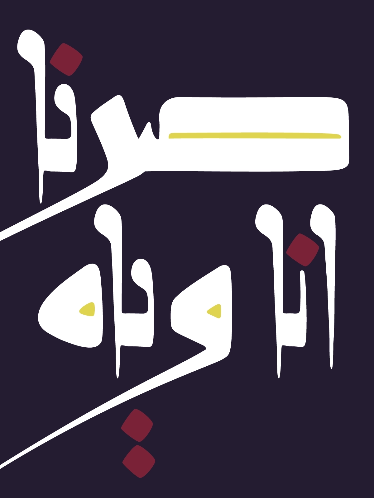
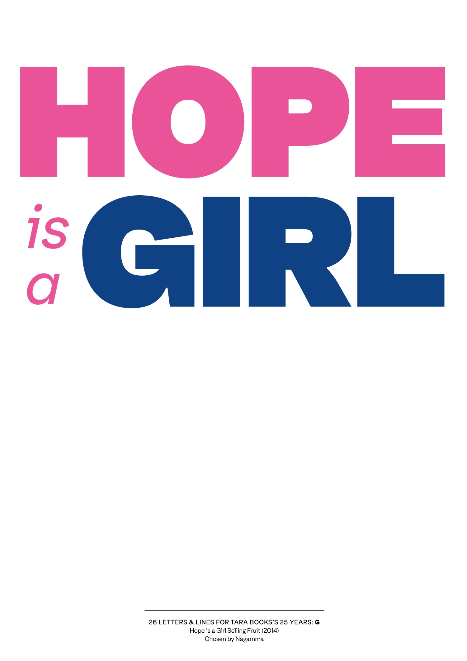
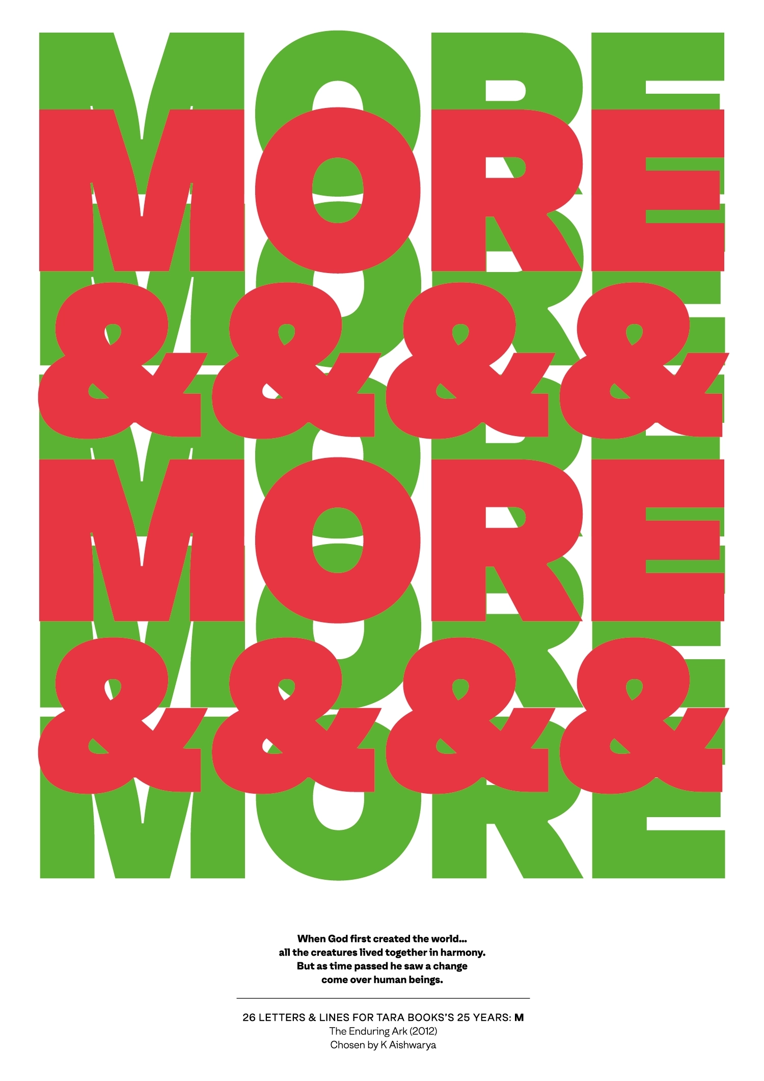
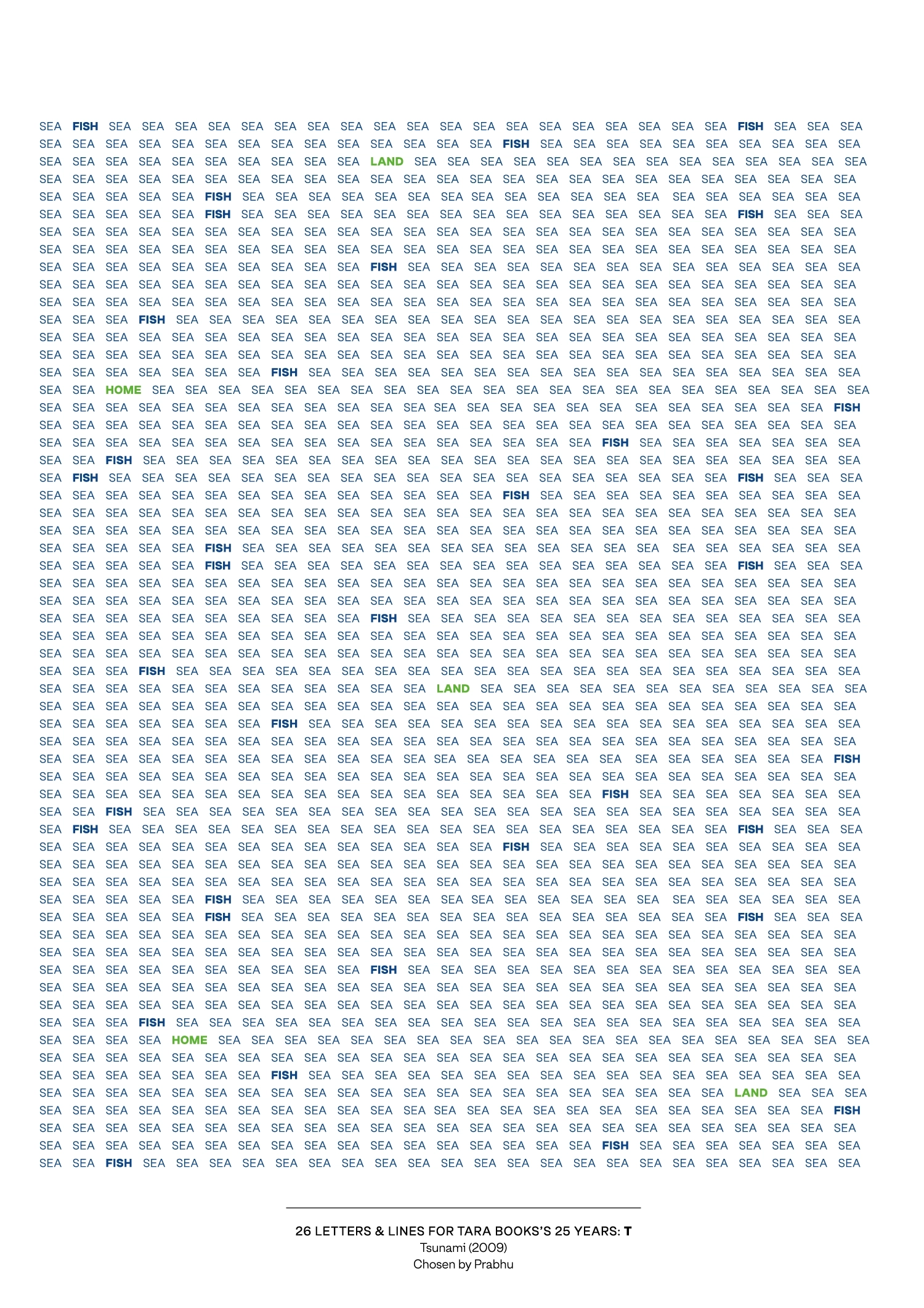
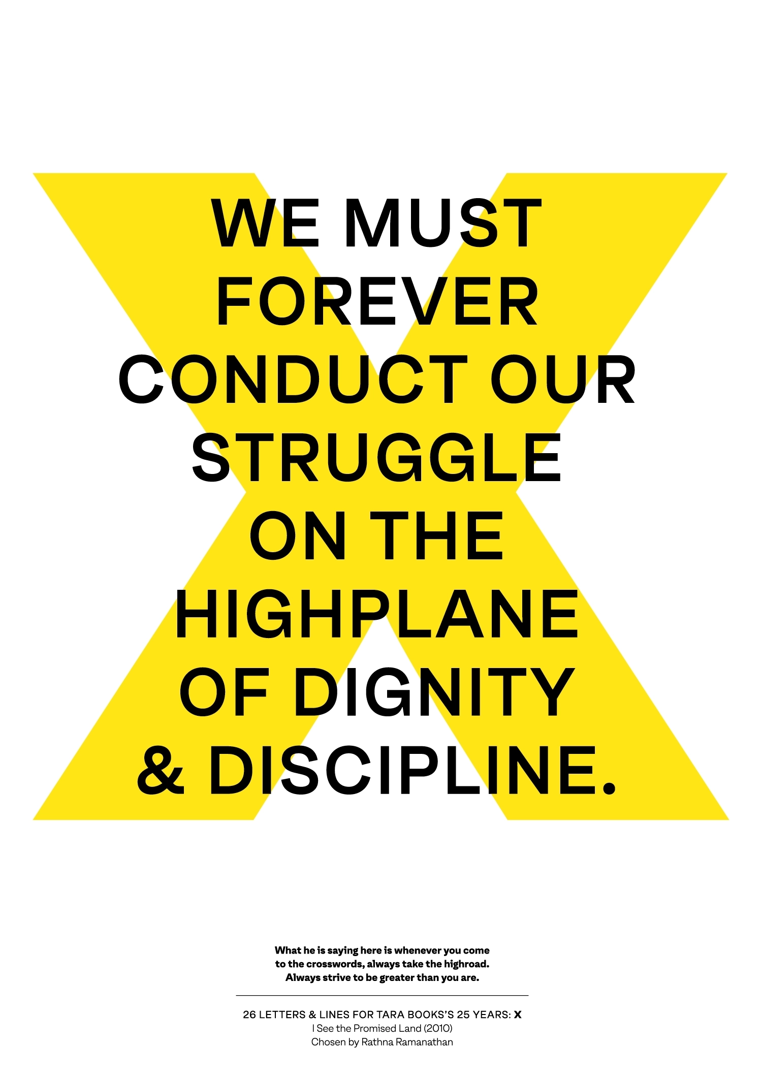
26 LETTERS & LINES is a specially curated exhibition to mark 25 years of Tara Books. It comprises a set of posters featuring lines from many of our books. These lines were chosen by the members of the Tara community and then set to type by designer Rathna Ramanathan. She worked with Oli Grotesk, a typeface designed by Shiva Nallaperumal.
Each of the 26 posters links the chosen lines to the world around us by artfully foregrounding an alphabet. Some posters are humorous, others poignant, some crafty and others poetic.
The driving spirit behind the exhibition is a belief in the power and possibilities of language. As Rathna notes, 'Language shapes our identities. Words bring us together in cooperation, though, at times they can also cause wars'.
Typography responds to the power that words hold out. It explores and embodies voice, accent, tone, rhythm, pitch and perspective. It does this in ways that can change the way we understand, communicate and engage with each other and the world.
By bringing together a range of reading and visual choices, 26 LETTERS & LINES celebrates our publishing vision, which draws from many professions and disciplines, and is sustained by a creative force to do good.